Cushion
Scaffolding the account page
This weekend, I started scaffolding Cushion’s account page that I redesigned in time for SCA regulation. While I know that “scaffolding” is a loaded term in programming, sometimes referring to database generators, I more often use it when referring to building the no-frills parts of an app or webpage—like wireframing for developers. At Stripe, we’ll start a page by “scaffolding” it using all of our reusable components, then we can move on to coding the fancy animations, which require more time and consideration. In Cushion, I’m scaffolding the account page by building the static version of it based on the design, then wiring everything to the backend.

Sometimes when I scaffold a page, I’ll need a few new components, which was definitely the case with the account page, since it’s essentially the first page with the new design system. I’ve already built a handful of components for the new onboarding, but that’s not technically inside the app, so it doesn’t count. That experience did, however, result in a very solid component environment for Cushion, including Storybook for documentation and Jest for testing. Now, when I need to build a new component, I have a routine to follow and it’s not a big deal at all.
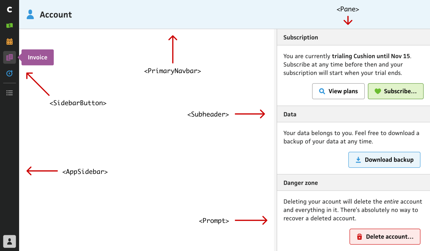
For the account page, I ended up building pretty much every component from scratch so far—except for the buttons, which I already had from onboarding. While this seems like a ton of work, it didn’t feel like it, and I’m incredibly happy with how “shallow” the components feel. So far, I haven’t gotten to any deep components that risk becoming a rats nest, so there’s still time, but it feels amazing to compose a page so easily without all the cruft from the nearly 7-year-old code in the existing app.
One of the most notable components I built was the <AppSidebar>, which needs to mimic the sidebar in the existing app, but improved with what I’ve learned since then. The new sidebar will eventually add the “Clients” and “Projects” sections, but those aren’t built yet, and the existing app doesn‘t have them, so I need to leave them out for now.
I’m also leaving out the “preferences” icon in the bottom left for now because that actually opens a modal instead of navigating to a section. Since I’m in the new codebase, I don’t want to mix any legacy code, so I can’t include preferences until it’s built in the new codebase. I’m still on the fence about that icon opening a modal versus navigating to a proper “Preferences” section. While I do like having the ability to change certain preferences without leaving where you are in the app, I also think there might be an opportunity to do this in a more intentional way compared to an omnipresent top-level button.

Stripe’s web interface for visualizing and manipulating its color system.
One aspect of the buildout that is consistently top-of-mind is color. I’m carrying over my colors from the existing app, but trying to shape them as I built out the app. For most of the colors, I have a “normal” shade and a light shade. Now that I’m trying to make Cushion more accessible, I need a slightly darker shade for button borders. In certain scenarios, I might also need another shade for icon colors. This keeps making me think of the Stripe blog post about accessible color systems. Building a similar system would definitely be a poor use of time for Cushion’s scale, but maybe I can convince Koop to let me use the fancy color tool they built…
From here, I’ll continue to scaffold the form itself, then wire the rest of the page to the backend. That still entails saving the form, downloading a backup and waiting for the background job to finish, and deleting your account—including the confirmation prompt. For downloading a backup, rather than poll for the background job, I might take this opportunity to change the system to a more async approach where Cushion emails the user their backup when it’s ready. In most cases it only takes a hot second, so that might be overkill. Or, I could determine the size of their account and either download right away or email as a background job. That would still be overkill, but for a better experience!