Cushion
Building components for the long run
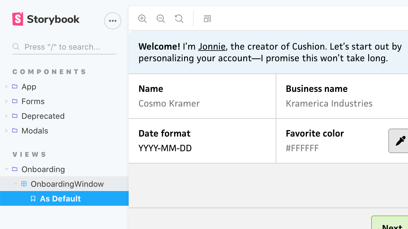
This past weekend, I made great progress on Cushion’s new onboarding flow. I built most of the necessary form components, which included <CurrencySelectField>, <CurrencyInputField>, <DateInputField>, and <ColorInputField>. While the buildout is taking longer than expected, I’m totally fine with spending more time upfront on them because I’m building them for the long run. They’re all thoroughly unit tested, they have 100% test coverage, and they’re all documented in Storybook. This means that I can use the components wherever I need them and they’ll work exactly as expected. More importantly, I can confidently make changes to them and immediately know if any functionality broke. This is testing 101, but it’s also a valuable reminder of why I should keep following this approach—instead of letting my excitement take over while I code heads-down at full speed.
I started out building the <CurrencySelectField> component. This provides a dropdown for people to specify their currency. I currently use it for both the user’s default currency and individual client currencies. While the component could certainly be a simple dropdown, I saw an opportunity to improve the UX. The current list of currencies is long. In fact, there’s 168 currencies in Cushion right now. I was curious if all of these were actually being used, so I ran a query on both user currencies and client currencies. I discovered that over the past six years only 73 of the currencies were actually used—30 of which were used less than ten times. Because of this, and the fact that I’m the sole decision-maker-slash-bossman at Cushion HQ, I decided to reduce the list to those 73 currencies. In the rare occasion that someone new comes along and can’t find their currency, I can simply add it.
While querying, I also discovered that there are six currencies that are overwhelmingly used by the majority of Cushion users—USD, GBP, EUR, AUD, CAD, and NZD. Instead of making the majority of the user base scroll through the entire list to find their currency, I grouped these as “Common currencies” using an <optgroup>. Then, I kept the remaining currencies a group called “All currencies”.
I could stop there, but there’s one last UX touch I want to make—a separate group for “Your currencies” that appears once the user starts using the app. If they specify a currency that’s not in the common list, I can include it in a list of currencies that they actually use. This makes it easier for everyone, but also avoids bumming out users who always find themselves needing to scroll all the way down the list to find their currency.
Next, I tackled the <CurrencyInputField> component, which Cushion uses for specifying an amount of money, like a project’s estimated income or a line item’s rate. This component uses the currency value from <CurrencySelectField> to format itself from a number to a currency string. At first, I considered formatting the currency in realtime, so dollar signs or thousand separators would be inserted automatically as the user typed, but currency is too complex for that—I can save this fancy UX approach for a simpler, more predictable input, like the <ColorInputField>, which is based on simple hex values. For this component, I decided to format upon “blur”, or clicking/tabbing out of the input element. This helps maintain a formatted appearance without getting in the way of the user’s typing.
I also decided to try a new currency library. For as long as Cushion’s been around, I’ve used Accounting.js, which has been really solid the entire time, but looking at its GitHub repo recently, I was a bit spooked by its lack of activity. Not necessarily its code activity, since a library could certainly reach the point of being “feature complete”, but all its unanswered issues and pull requests. At the very least, I’d expect folks to respond to someone asking if it’s still being maintained.
Just in case, I took a look around and found currency.js, which seems like a decent option upfront. Aside from its activity, it also has a nicer API and is typed well—I’ll be able to use its currency type for any currency-related code. It also handles currency math, so I could potentially shed Cushion’s Big.js dependency. My only concern is whether it’s actually 100% solid when it comes to JavaScript’s floating point issues. I know it explicitly points it out in the repo’s readme, but I’m still going to add a few test cases to double-check.
From there, I moved onto the <DateInputField> component, which handles dates (without time). While there is a native <input> element for dates, using the type="date" attribute, it only supports one display format (that I know of) and Cushion requires a bit more complexity within the date picker itself when it comes to date ranges. Similar to <CurrencyInputField>, the <DateInputField> has its own “format” property, which switches its presentation between YYYY-MM-DD, MM/DD/YYYY, etc. Because of this similarity, I was able to follow the same approach with this component—instead of formatting in realtime, I format on blur. While the formats specify MM, DD, and YYYY, I did spend some extra time supporting M, D, and YY as well by padding the values on blur. I figured it’d be easy enough for me to build this in now and avoid folks tripping over the need pad it themselves. I do plan to add one more little UX feature of showing light text for the rest of the date format as you type, but I haven’t gotten that far yet. In the meantime, I have the date format as the input element’s placeholder.
For the date formatting, I decided to stick with date-fns, which I switched to from Moment.js several years ago. The biggest selling points for me are its size, API, and immutability. There is a new major version out that’s a bit more strict when it comes to parsing, but because I’m thoroughly testing my front-end components, I can easily account for this.

So far, I’ve only finished the input component itself, but I still need to tackle the date picker popover. In the past, I simply displayed an element with position: absolute within the component and called it a day, but this resulted in a few tricky situations when the component is within a container that has overflow: hidden. Unless I positioned the popup to smartly position itself within the container, it gets cropped. Sometimes, there were situations where the container wasn’t big enough to fit the popover, like in a line item. To avoid all of this, I’m going to consider using a “portal”, which is like a slot outside of the component. Vue 3 supports portals natively, but until Vue 3 is officially released, I’m going to try out PortalVue. I’ve really tried to cut back on dependencies, but this might be a necessity—unless I magically find the time to write this functionality myself. Also, I absolutely love the swaying Vue logo animation on the website.
Lastly, I built the initial <ColorInputField> component, which lets the user type a hex value or select a swatch from a popover. For now, I focused on the input itself, since the popover involves the same trickiness as the date picker—I’d rather tackle those together. As mentioned earlier, with the simplicity of the hex format, I took this opportunity to format the input in realtime—sort of. When the user begins typing, Cushion will automatically insert a “#” character at the beginning, so they don’t need to add it themselves. I also made an executive decision by opting for all caps and 6-character hex values. For the former, I simply capitalize the characters as the user types. For the longform hex values, I actually format these on blur to avoid formatting too early, but like the ”predictive date” idea in the <DateInputField>, I’m also going to show the full hex value in light text as the user types. This will help give folks a heads-up that typing a single “9” is going to be treated like “#999999”, etc.

For the color popover, I’ll probably keep it similar to the current one in Cushion, which shows ~20 hand-picked colors along with a random swatch that you can click to generate a new color. I might let folks scroll through more colors, but I’m on the fence about whether that would be too much. Maybe scrolling shows an infinite list of random colors… now that’s an idea!
It feels really good to invest the time to build these components in the most future-friendly way possible—typed with tests, coverage, and documentation. While I do think Cushion’s existing components are solid, without typing or proper tests, I don’t have the same confidence that I do with these new ones. I also think the new ones are more future-proof when it comes to the design. Their rectangular frame is more mobile-friendly while providing a much easier shape to work with—no need to worry about spacing or dividers.
This week, I’m hoping to wrap up the rest of the work for the onboarding flow, so I can ship it ahead of the monthly newsletter. There’s still a considerable amount of work, but I’m thrilled with the lasting progress. The best part of focusing on these particular components is that when I need any of them in the future, I can simply plop them into the code and know they’ll work. Instead of thinking that it took how many hours to finish a single component, I can rest easy knowing that those hours saved me countless hours in the future.