Cushion
New year, new homepage
Happy New Year! It’s such a relief to have 2021 behind us, but with the way things are going in New York right now, it feels like we’re back in March 2020 again. To keep spirits high, I decided to spend my holiday break playing around with a fun redesign of the homepage.
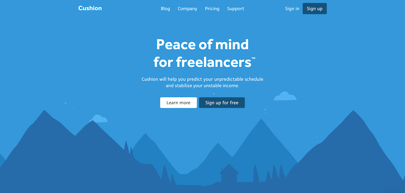
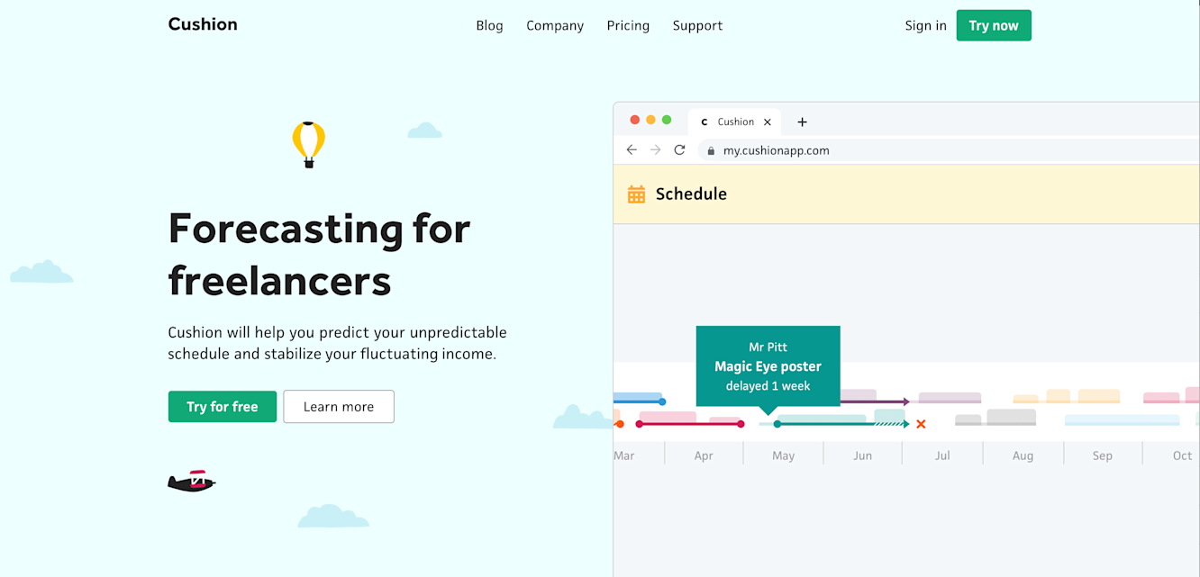
Homepage hero (2021)
When it comes to the homepage, I’ve been so back and forth with its design and content over the years. For some reason, last year I thought it’d be a good idea to return to the minimal 2015 design, but include a calming night mountainscape in the hero with a cabin that animates smoke from its chimney.
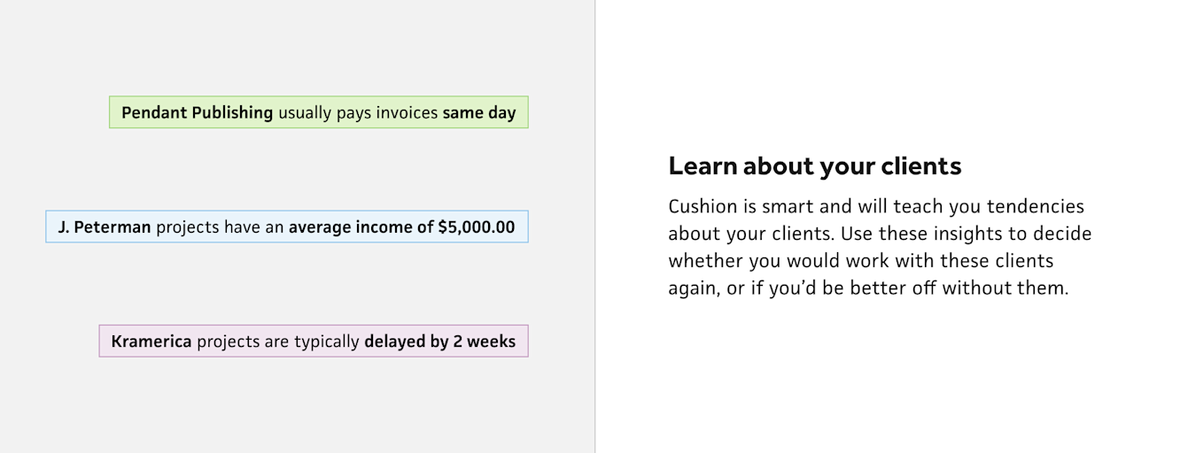
Homepage feature (2021)
I quickly realized, however, that the scarcity of information about Cushion led folks to spend little time on the site and not sign up as much because they obviously didn’t have much to go on. I asked myself—would I sign up for an app if I barely knew anything about it? Probably not. And would a few static visuals that may or may not be cropped screenshots from the app be enough to entice me to join? Again, probably not.
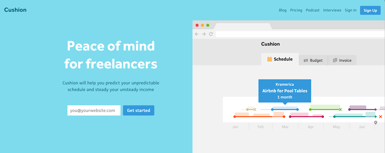
Homepage carousel (2016)
With this in mind, I was dying to bring some fun back to the homepage and revisit a time when Cushion had a super friendly vibe to it. Thanks to The Wayback Machine, I can pinpoint this time to 2016. I had recently secured funding, and finally had a budget to hire my freelance friends, like illustrator Laura Bohill.
Illustrations by Laura Bohill
I told her what I had in mind, and she illustrated a handful of icons and landscapes for the marketing site. I’ve continued to use these over the years, but 2016 was when they were illustrated for this specific design. I still love them, and I always felt like they deserved to be properly animated, like other collaborations Laura and I have had together, so I decided this would be my chance to have a lot of fun while building a homepage that could better attract folks’ attention.
When designing the new homepage, I had a handful of goals:
Make it fun and friendly
Animate anything that should be animated
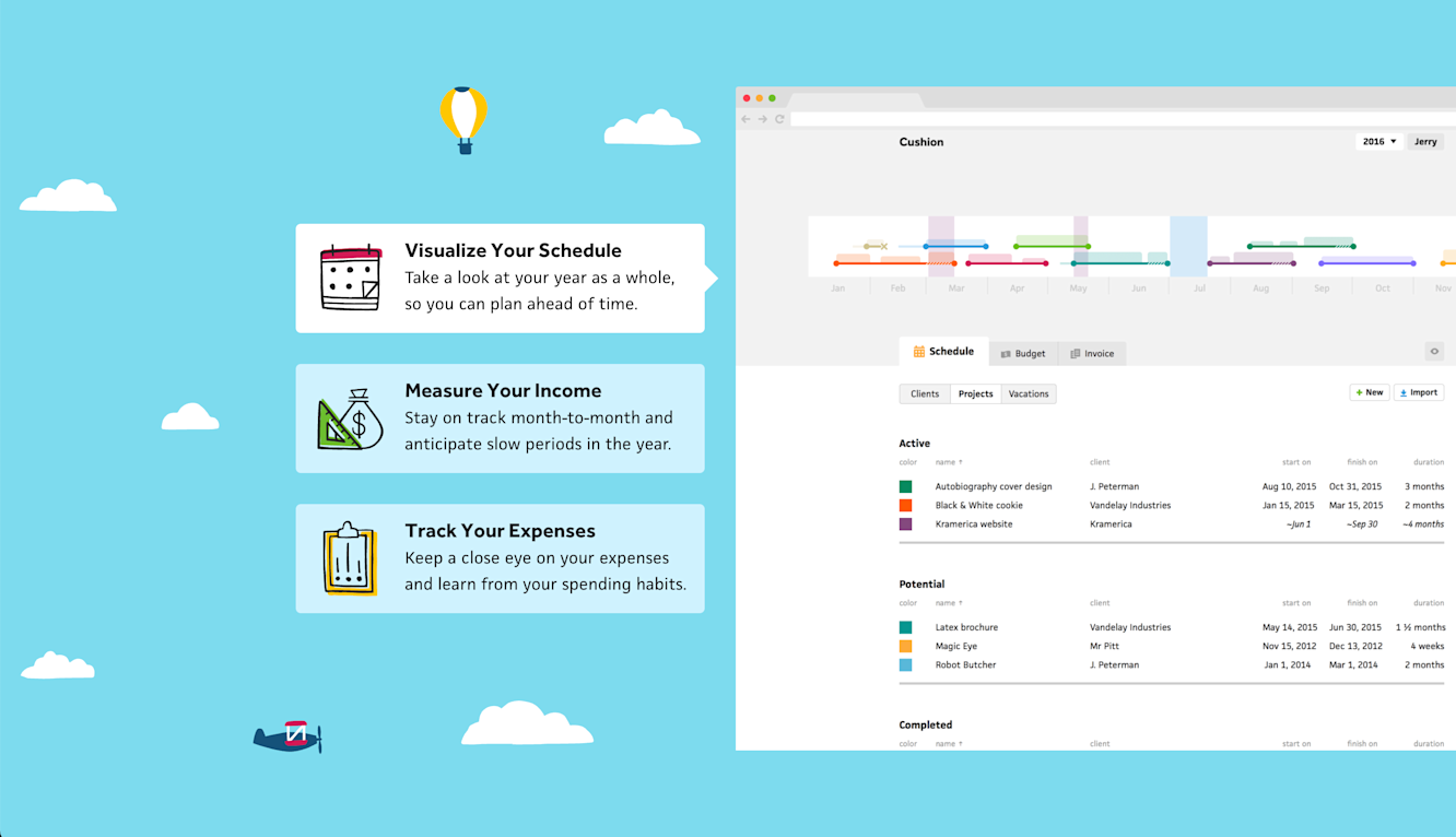
Show the app! (especially in the hero)
Highlight all of Cushion’s additional content, like the Ask a Freelancer podcast, Talking Shop interview series, journal, and running costs
New homepage hero
To make the homepage fun and friendly, I brought back the hand-drawn icons and illustrations as mentioned earlier, but I also lightened the color palette. Looking back and previous designs, I think I went too far down a path of focusing on a dark, calm nighttime look instead of a bright, colorful, playful vibe.
Homepage hero (2016)
Because of the darker look, I always ended up with heavy fills and knocked out text. In much older designs, like the 2016 one, I tended to use many mid-range colors with white text. This never felt great, and was questionable as far as accessibility and readability go—not to mention how difficult it is to find a call-to-action color that stands out on a mid-range color. Now, with a lighter look all around, text is as readable as it gets and all the buttons feel strongly anchored on the page.
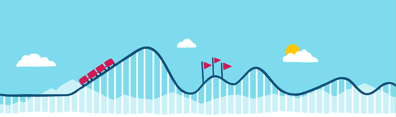
Roller coaster illustration (2016)
In past designs of the homepage, while I did use the illustrations to depict a fun and friendly vibe, they were all just static images—dying to be animated. I never took the time to bring them to life before, but now that I did have the time, and I’ve been specializing in SVG animation, this was the perfect opportunity to display them the way they were intended to be displayed.
In the hero, I started by animating the clouds, like I’ve done in the past. Then, however, I took the hero to the next step and animated both the airplane and hot air balloon. For each of these, I rely on a simple sine wave using Math.sin to animate the up and down movement as I linearly move them in their respective directions. I also rotate them slightly on a cosine wave, which creates a more accurate movement of the airplane’s nose as it climbs & dips and the subtle swinging movement for the balloon.
For the airplane, I needed to represent a moving propeller. At first, I wondered how I could animate it, but then I realized I could achieve the appearance of a rotating propeller simply by hiding it every couple of frames. In code, I toggled its opacity, which is one less repaint because it keeps the animation on the GPU. Using a modulo, the code itself is as simple as opacity = Math.floor(frame / 2) % 2 === 0.
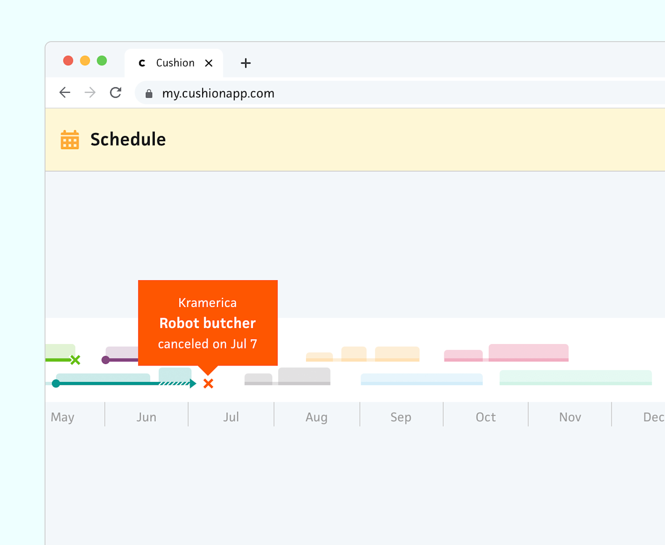
To achieve my goal of showing the app more, I kept it traditional and simple by including the UI in the hero. I did this because in the previous design Cushion got a lot more folks signing up on mobile, then getting stuck. I realized that because there was no clarity around what kind of app Cushion is, most assumed it was a mobile app. The ideal fix for this would be a mobile-friendly app, but as a solo dev, I’m not there yet. In the meantime, however, I included the browser window with the UI to emphasize that Cushion is a web app. Then for the animation, I simply cycle through several schedule scenarios to preview the sort of insights you could see in the app. I didn’t invest too much time here because when the new Schedule timeline launches, I plan to replace this UI with it.
In the next section, I kept the “purpose copy” that I’ve had since nearly the beginning, but I brought back the roller coaster illustration from the 2016 homepage. To sell it more this time, I had the idea to illustrate a before & after of folks using Cushion. On the left half, the track has steep ups and downs, then on the right half, the track smooths out into a consistent rhythm. I’ve been wanting to build this animation for the longest time, and I’m thrilled to have finally done it because it’s a much stronger visual for folks who know the ups and downs of freelancing.
On the technical side, I ended up dynamically drawing the vertical lines and track instead of using the actual illustration in order to animate them. Once again, I relied on a sine wave to control the vertical movement, but for the left half the track, I gradually decreased the sine wave’s radius using a cosine wave. This results in a more organic movement than straight up and down—the track moves more like those terrifying videos of wobbly bridges.
Roller coaster car (before gravity)
For the roller coaster car, I made use of the getPointAtLength method to animate the car along the path, but that was the easy part—rotating the car to realistically follow the ups and downs of the path was trickier. For this, I used Math.atan2 to get the angle of the path between two points. While this works, it alone looks unrealistic because the car is moving linearly from left to right while going up and down the steep track.
Roller coaster car (after gravity)
In order to make it feel more realistic, I eased the rotation of the car, then factored the steepness of the car’s rotation into the speed of the car. When the car is going down the steep track, I increase its speed, but as it goes up a steep incline, I slow it down. All of this combined results in a pretty realistic looking roller coaster—for an illustrated web animation.
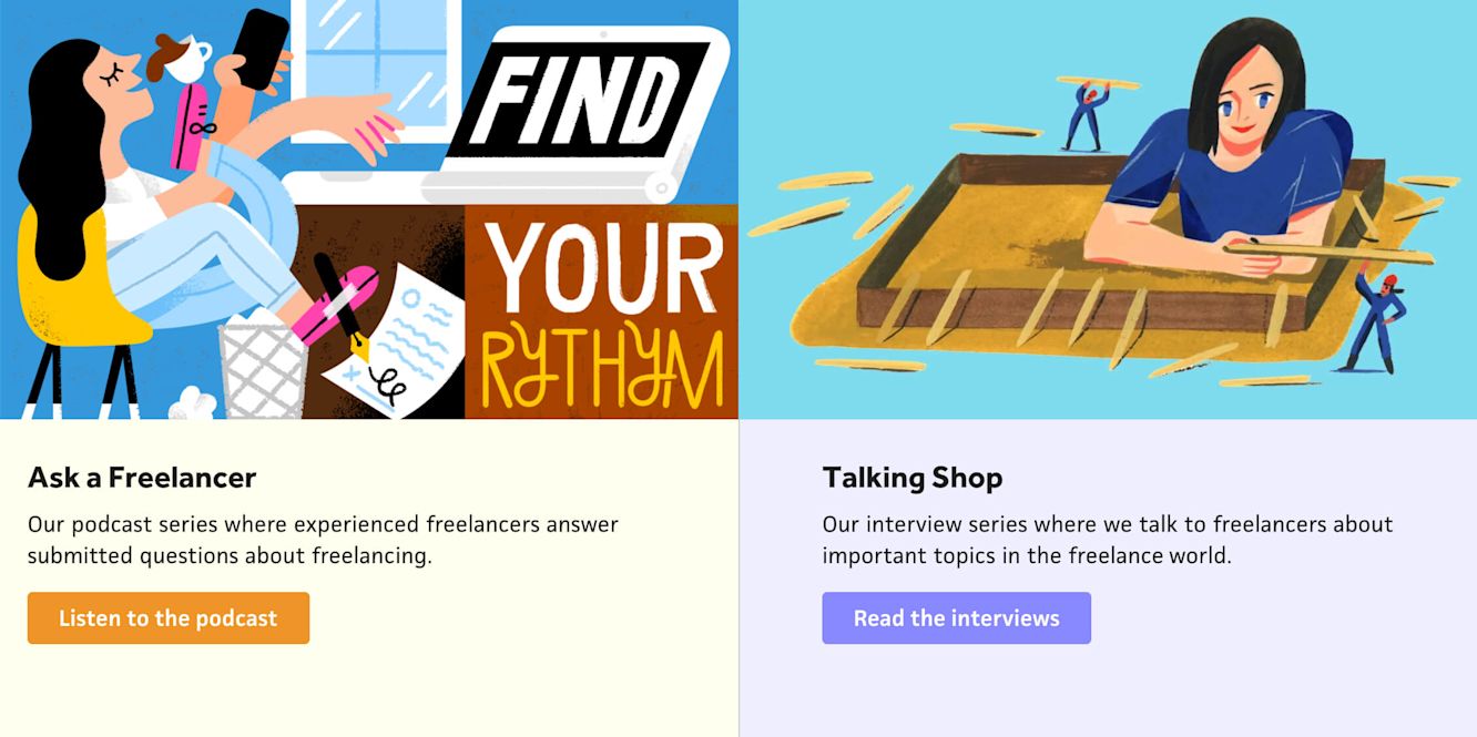
Next, after the back-and-forth feature section from the previous design, I added a row for the Ask a Freelancer podcast and Talking Shop interview series. I still absolutely love these series, but I ended them after a year—mostly because of budget, but also because folks got busy. Regardless, the content feels timeless to me as it’s always relevant to the freelance life, which is why I was so determined to showcase them. Since the page has already had a healthy amount of animations, I decided to keep this section simple with static images, straight-forward descriptions, and clear CTAs.
Behind the scenes (grid)
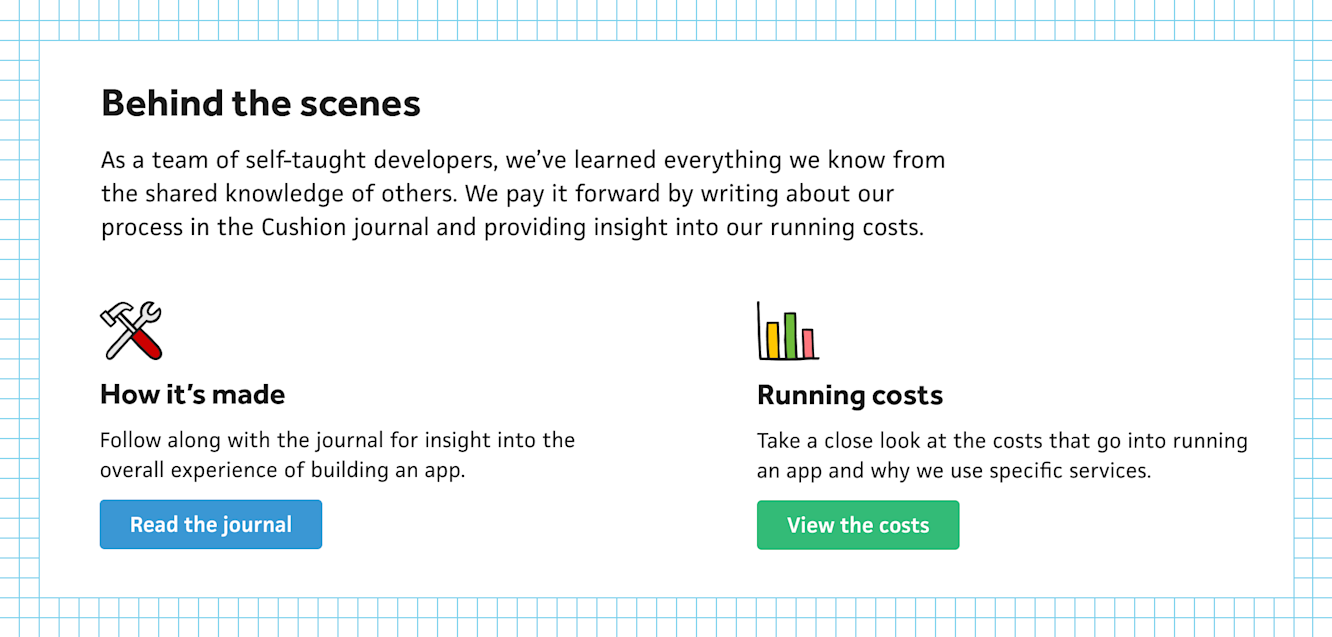
From here, I also wanted to showcase the “Behind the scenes” portions of the site, which includes this journal and Cushion’s running costs. I actually spun my wheels for a while with this section because I wanted the work-in-progress / transparency angle to come through, but I wasn’t 100% sure how to visualize that. For a minute, my strongest option was a cyan grid background that felt like a sketchpad, but this didn’t sit right with me—it was decent, but it didn’t bring me joy.
Behind the scenes (wireframe)
I ended up having an idea in the shower where I could reuse the existing animations as wireframes. This would get the point across of being behind the scenes while also including some fanciness in the section. Since a cyan wireframe on white looks good without distracting from the content, I was able to add some variation to the page and bring out the color in the icons by using a white background. I’m really happy with this section, but I also don’t want it to feel like I’m phoning it in because I’m reusing the animations, so I might swap them out for different ones if it wears on me too much.
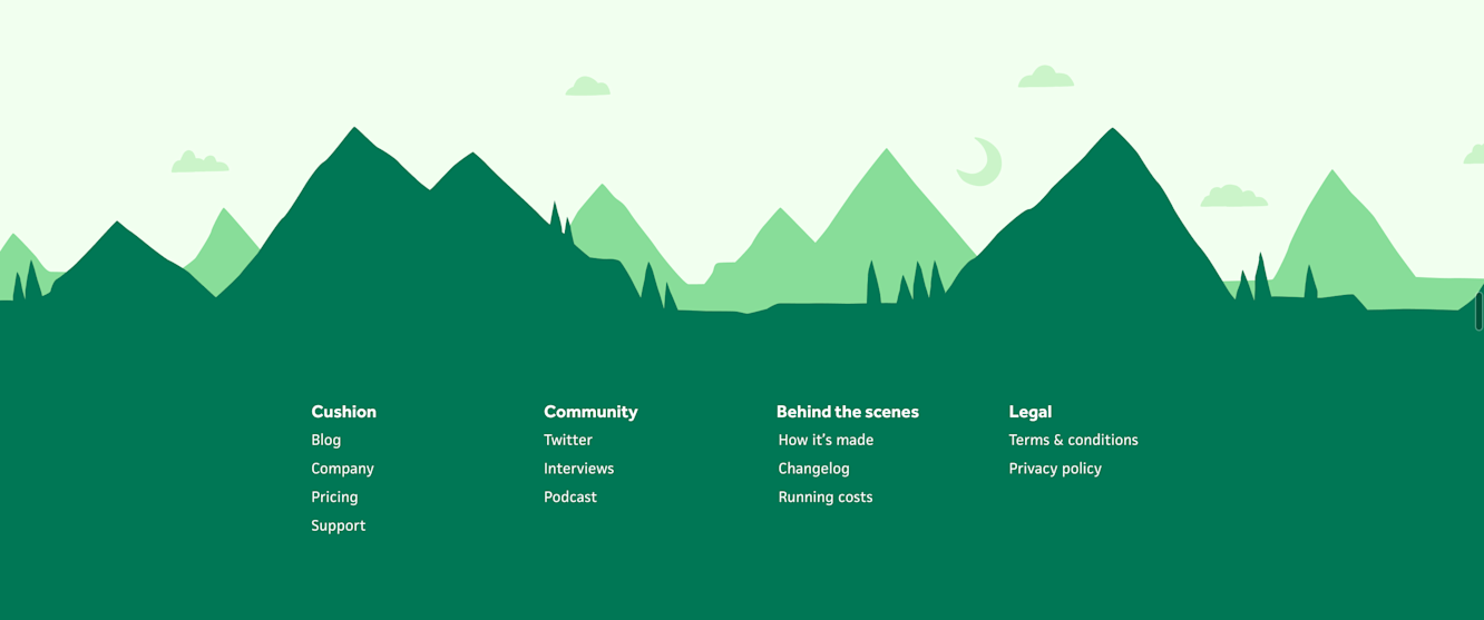
Footer (2021)
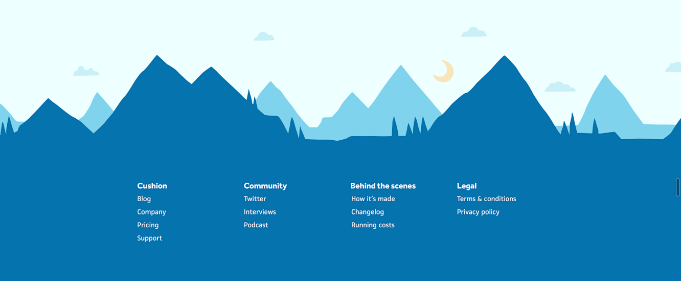
Lastly, I tackled the page’s footer. This section was lazily only text before, and that made me sad, so I again felt determined to make it more fun. I still loved the mountainscape hero in the previous iteration, but I didn’t think it deserved to be in the hero. I did, however, feel like it could be a strong end to the page. With all the other sections being light colors or white, this was a great opportunity to ground the entire page on a solid dark fill. I positioned the footer CTA in the sky of the mountainscape, then listed the footer links in the ground with the cabin in-between.
Monotone footer (blue)
Monotone footer (green)
At first, I considered a monotone look for this entire section, which did look pretty decent on its own, but when stepping back to view the rest of the page, it looked off. Instead, I decided to carry over the blue sky from the hero and break out of the monotone look with green mountains. This gave off the appearance of a happy, healthy forest—exactly the look I was going for.
New homepage footer
Now that the page is more-or-less wrapped up, I’m back to the schedule timeline beta. In parallel, however, I’m still working on other parts of the marketing website. High on the to-do list is actually migrating these journal posts back to the Cushion domain. A couple years ago, I moved them to my personal website because I wanted to keep all my blogging in one place. Right now, however, I’d much rather have more residual traffic for Cushion than my personal site, so hopefully that makes a difference in the numbers. I also plan to spruce up the testimonial section of the homepage, which is such an afterthought right now, but I just don’t have inspiration for it yet.
Let me know what you think of the homepage, or if I should dig into anything specific with the animations!