Cushion
Improved form UX
This past weekend, I focused on usability in Cushion. My first stab on the layout of model forms was haphazard. While showing Cushion to a few people, I could see an obvious hesitation on where to start when creating a new project. All of a sudden, the user is presented with fields all over the place with no clear direction.
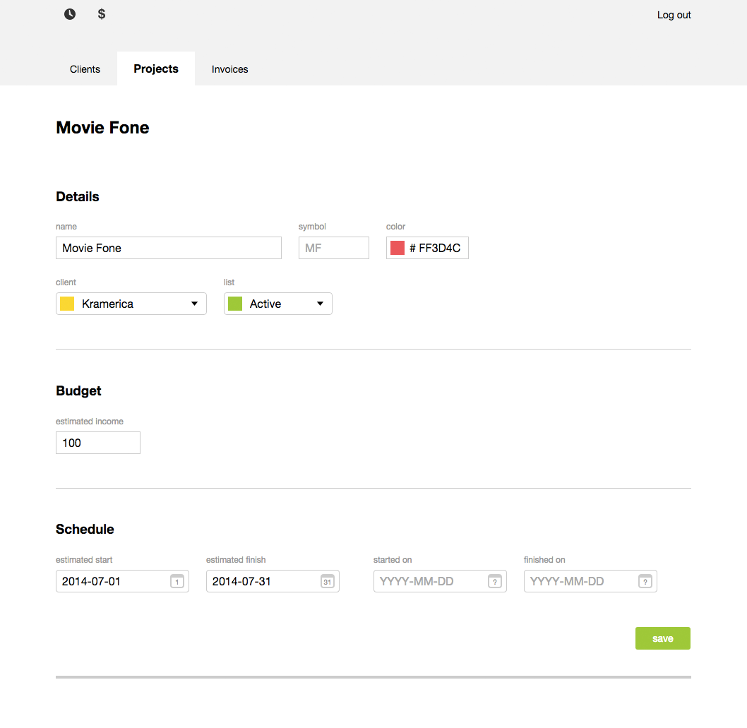
Believe it or not, I had a dream about the new layout and it’s the one I’m going with. Instead of letting the sections rest aside each other and reflow when needed, I just stack them and separate with dividers. Now, the sections actually represent the different views of Cushion (schedule and budget) and there’s a clear flow from top to bottom.
At first, I was worried there would be too much negative space in the smaller sections, like budget, but it doesn’t feel as bad—especially if I end up going with a budget range instead of a single value. Also, this layout allows me to potentially include mini visuals for each section that provides more context than just input fields. Imagine the budget section including the average budget for your projects or the average budget for the client of that project. All of a sudden, you have a better idea of where to start.
Along with a revision of the layout, I’ve been working on improving the actual input fields. From the start, I chose HTML5’s native input types, thinking these would take care of a ton of extra work in the early stages. Unfortunately, some of the native input types, like <input type='date'>, are cemented in ugly (can’t be styled) and don’t even work in common browsers like Safari.

The first input type I tackled was the color picker. I took a page from my buddies at Friends of the Web with their Dayswork app and provided a simple popover of suggested colors. I hate color pickers on the web that mimic those in design tools like Photoshop—they assume everyone is a designer. With suggested colors, any one of them will look good, and in most cases, you won’t need to use it because your client already has an established color. Considering this, the color picker is more of an easy way to get started.

Next, I addressed the date picker. For this, I wanted a design that is both useful and obvious to navigate—it should also have a couple Cushion-specific features that support the reasoning behind going custom. For instance, if the date is part of a range, the dates within the range should highlight to indicate that. Also, for validation purposes, you shouldn’t be able to pick a finish date that comes before the range’s start date.

In filling out the forms, I also realized how tedious the process felt. Because of this, I added value inheritance. Let’s say you create a new project, but it doesn’t necessarily call for a color other than its client’s. Before, you would need to re-enter your client’s color. Now, it defaults to using the client’s color unless specified otherwise.

This also works reversely for the inline client creation. If you create a new project and set its color, the inline client will inherit that color by default.
Lastly, client and project symbols are now auto-generated with the ability to override them. This means if you create a new client named “Vandelay Industries”, its symbol will be “VI” by default, but you could overwrite it to something like “VanInd” if you want.
These recent updates have me incredibly excited to get Cushion in the hands of others as soon as possible. I know most of them are unnecessary for an initial beta release, but I want this app to be a joy to use from the start.