Redesign
Filter by category
Now that I’m consistently writing again, I felt the need to add category filtering to the blog. I actually felt this way a few months ago and built the category pages, but never ended up finishing the nav for them. More recently, I found another reason to revisit category filtering, but I’ll write about that in the next post… For now, let’s focus on the design.
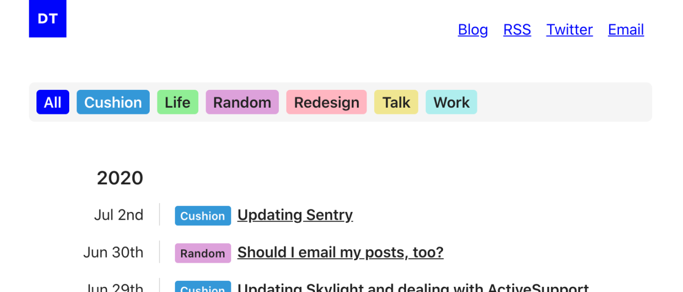
Luckily, the existing design for the categories helped direct the design of the category nav. I simply reused their component and linked them up. To give them a slightly more solid footing on the page, rather than leaving them floating, I gave the container a light grey background (whitesmoke, to be specific). Then, I added a scroll behavior to make the category nav disappear as soon as you start scrolling.
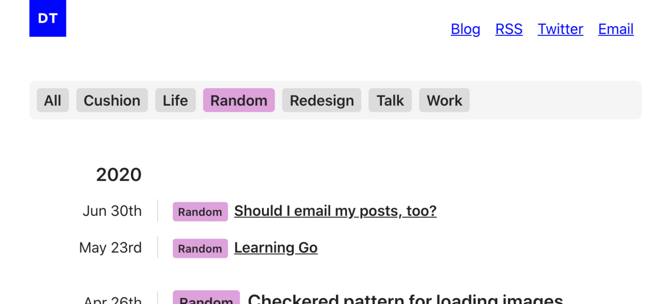
On the category pages themselves, I wanted to indicate which category the page represented, but I didn’t want to add an additional title element for this. Instead, I created an inactive style for the other categories, so the active category would be more prominent. I absolutely love how it looks—especially with the nav category matching the blog post categories listed below it.