Building the Open Standard website with Stripe

Earlier this year, I had the chance to reunite with my friends at Stripe to work on a new website. I previously worked at Stripe as a staff design engineer, but this time, I collaborated with them as an outside contractor. The deliverable was an animated landing page in an all-out sprint. This is the same type of work I did when I was at Stripe and exactly the kind of freelance work I want to pick up now that I’m independent again—short-term with a clean handoff and a chance to make a splash.
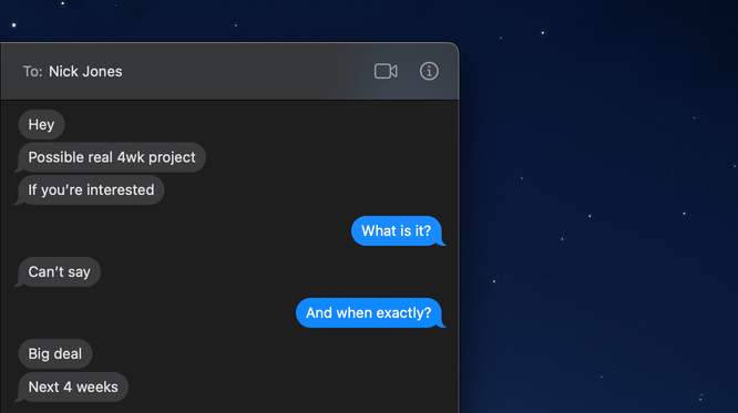
Cryptic text from Nick about a potential project
The reunion with Stripe came via my close friend and former teammate, Nick Jones. He texted me at the end of the workday on a Friday, saying he had a possible short-term project and asked if I was interested. He couldn’t tell me what it was—he could only tell me it was a big deal. If anyone else reached out like this, I would’ve enjoyed the weekend and responded on Monday, but this is classic Nick, so I responded right away.
Later that night, I hopped on a call with Nick and Stripe’s Head of Brand Studio, Michael Jeter (aka Jeter). On the call, they couldn’t tell me much about the project, but they did tell me that I would collaborate with the incredibly talented designers on Stripe’s brand team: Jonny Naismith—the other “Jonnie/Jonny” at Stripe and a brother of mine—as well as a couple new friends, Dom Baron-Chartrand and Pete Henderson.
After marinating on it for a few days, I signed an NDA, learned everything, and accepted the project. They wanted me to build the website for Open Standard—a new stablecoin for global money movement, with partners including American Express, Mastercard, and VISA. I’m personally not too familiar with stablecoins, but considering those names, I would call this “a big deal”, too.
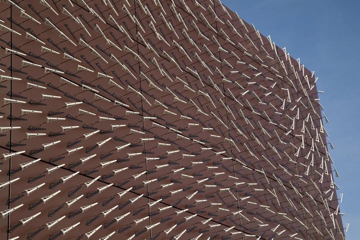
Windswept (2011) by Charles Sowers. Photo by Bruce Damonte
Before we even kicked off the project, I had an idea in mind that I wanted to pursue. When I had a brief stint in SF, I remember seeing an installation called “Windswept” by Charles Sowers. The installation consists of a grid of “freely rotating wind direction indicators” that spin as the wind changes. Because they’re all aligned in a grid, patterns would emerge as they spin. A gust of wind passing through one area would rotate the indicators with varying strength, and as the wind dissipated or changed directions, the indicators would reflect the force passing through them. I loved this installation, and I’ve always wanted to recreate it in code. This was my chance.
Prototyping
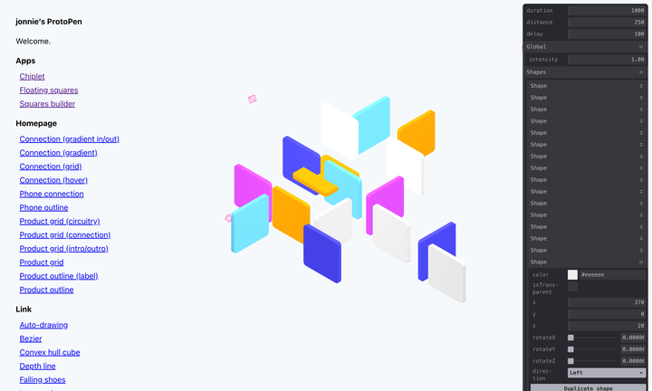
ProtoPen (2023)
I started by experimenting in a custom prototyping environment that I set up for the project, which is now commonplace for all of my freelance projects (and always included with the final deliverable as a bonus). This prototyping environment was actually a riff on an internal project of mine at Stripe, called “ProtoPen”. Think of it as the lovechild between Indexhibit and Codepen, but using local, vanilla files. This is the way.
Each “pen” consists of a directory including an index.html, a script.js, and a style.css file. ProtoPen detects these directories in the file system, lists the pens in the sidebar, and runs them when selected with realtime updates on save. ProtoPen makes it incredibly easy for me to spin up new prototypes and copy/paste directories to fork existing prototypes.
Attraction prototype
My earliest prototypes revolved around math. I rendered a grid of lines with the intention of rotating each line to point towards the cursor. This is a classic Flash experiment from back in the day, but it still holds up. The trick is to remember to normalize the rotation, so it doesn’t jump to zero when going above 360º or jump to 360º when going below 0º. I always treat these early “exercises” as a warm up for more complex prototypes.
Influence prototype
From there, I thought about the cursor as the “wind” from the installation. Instead of the lines using attraction to point towards the cursor, I made the cursor “influence” the rotation of the lines—and instead of lines, I used X’s to provide more detail and opportunities for pattern. The influence is based on the cursor’s proximity to each X, but also factors in its velocity as torque. This allows me to rotate the X’s as if the grid were a grassy field and a ball were rolling through it—rotating away from the cursor based on their own direction and angle from the cursor. Lastly, I incorporated damping on the X’s to slowly return them to their original rotation at rest—a departure from the installation’s mechanics, but better suited for the animation.
Influence (overlapping) prototype
As I continued experimenting, I realized that I could achieve much more interesting moiré patterns by reducing the gap between the X’s and overlapping them with a negative gap. This resulted in a visual that resembled a “low-res oil slick” that wasn’t quite right, but still interesting—a string worth pulling at.
Influence (circle) prototype
A few iterations later, I had the idea to replace the cursor as the point-of-influence with a controlled point on a looping path. Since the website relates to a “coin”—albeit a virtual one—I wondered what a circular path could produce. I changed the coordinates to follow a single point that moves on a circular path at a linear pace. This immediately resulted in a visual with real promise. With the right variable settings, the X’s carves a circular shape from the path of the influence point, but even better, the X’s that are closest to the inside and outside of the circle create their own shape—a fluid-like trail. Now, I was getting somewhere.
The Hero
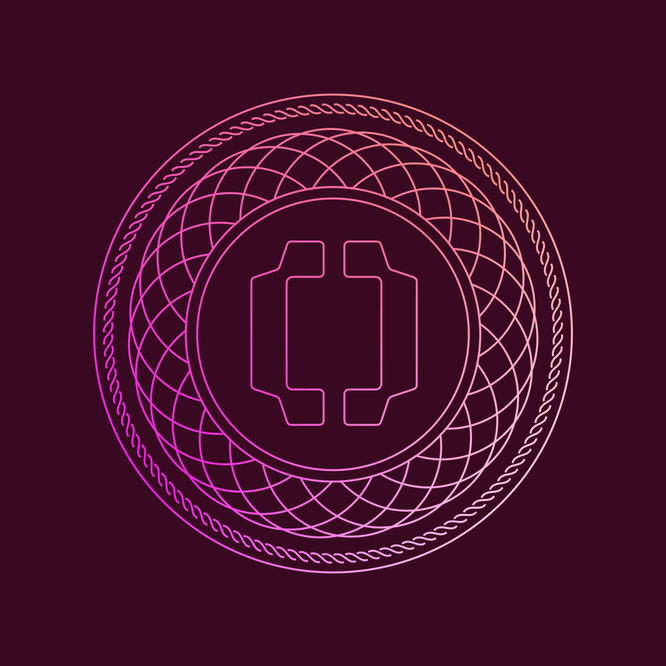
While I was busy prototyping, Jonny and Dom were designing the rest of the page in parallel. Stripe Press could publish a book with all the potential design directions this team churned out on such a quick turnaround. For sake of time, I’ll skip to the “end of the book” where they illustrate an ornate coin graphic as the anchor of the page—the missing key to my circular hero animation.
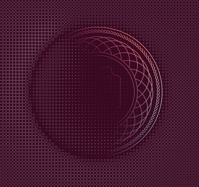
Still from hero animation iteration (not final)
Instead of only rendering a grid of X’s that rotate in the shape of a circle, we hinted at the coin by including the graphic in the hero—but using a feathered mask to keep more than half of it in the shadows. This helped us avoid giving everything away when landing on the page while intriguing the viewer enough to keep scrolling. I also took this opportunity to replace the rotating X’s with dots that scale for a softer visual, but also a better connection to the coin’s circular shape.
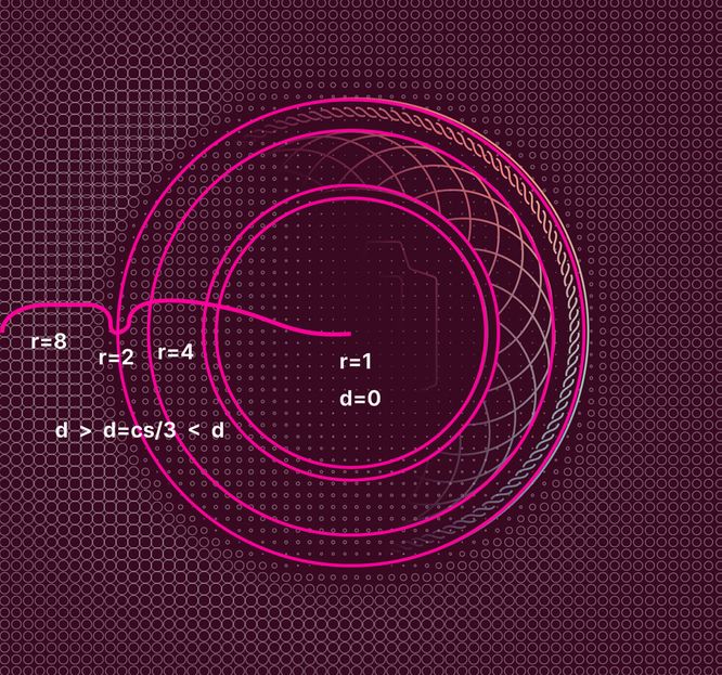
Sketch from thinking through indentation math
With the shadowy coin in place, I saw another opportunity to further polish the visual and give it more depth. The coin graphic itself has multiple circles within it at varying radii, but these are unfortunately lost outside of the masked area. I realized that I could adjust the dot grid’s scaling equation to factor in these coin circles as “indentations”.
Final hero animation
Using each dot’s distance from the center and edge of the coin, I simulated the appearance of a silhouette, as if the coin were imprinted on the page. This instantly provided a better shape to the hidden portion of the coin.
The “Problem”
Now that we had the hero animation locked in, three more sections remained. These sections represented the “problem” that existed, the “solution” Open Standard would provide, and the partners involved. From the beginning, we knew this page was destined for a sticky scroll-based animation to pair with the adjacent content, so we got to work on ideas for the remaining sections. I immediately envisioned a busy visual for the “problem” section to represent the activity behind a stablecoin, but I still wanted to keep the coin’s shape as a connection between the sections.
“Problem” section animation
With the dot grid, I realized I could actually expand it to become a proper system to work across all the animated sections. In the hero, the dots would scale to follow the circular shape of the coin with an influence point, but in the “problem” section, I could scale them “randomly” to look like circuitry and represent the inner workings of the coin—a peak inside the technology. The movement itself should appear chaotic, but actually be predictable. I leaned on randomness with a seed and sine waves to accomplish this effect. I also introduced a scalable solid “inner dot” to provide even more depth and illusion of movement.
Transitioning all the dots at once
With a sticky scroll-based animation, using triggered animations feels like phoning it in. I’m a sucker for scrubbable animations, so I improved the dot system to incorporate the decimals between 0 and 1. If the user is halfway between sections, the dot system applies the effects of both sections, but each at half-strength. At 75%, the effects mostly come from the upcoming section while still applying a pinch of the previous section’s effects. I find these in-between moments to be really special and sometimes more interesting than their eventual landing states.
Circle wipe scroll transition
While a “cross-fade” of effects across the entire grid would’ve suffice, I jokingly suggested that we use a “circle wipe” instead, like on Looney Toons—where the 2nd layer of effects could emerge from the center of the grid and expand outwards. When I showed the team, however, they ooo’d and ahh’d—a good sign to actually keep it. All I needed to do was feather the “mask”, so the edges of the circle wipe transitioned gradually, too. This effect is especially nice between the hero and “problem” sections, when the circle wipe matches the size of the coin silhouette’s inner circle.
The Coin
Now that we had a couple sections under our belt and an increasingly versatile dot system, it was time to tackle the “solution” section, which reveals the coin graphic—this is where Pete steps to the plate. Pete is a motion designer at Stripe, and as soon as he shared an animation of the coin graphic for a marketing video, 1) I knew he was legit, and 2) I took that as a challenge to match his work 1:1 in code for the website. I don’t think Pete realized—by sharing his animation—he would be issuing me a challenge. SVG animations are my expertise, so I quietly got to work while smiling ear to ear—I only wanted to share this particular animation when it was ready for Pete to scroll himself, at 120fps.
Coin animation
Once again, I used the circle wipe transition, but this time, I animated the coin graphic from the center in parallel—following the outwards direction of the background transition. The coin animation starts as sequentially growing circles that mask out an emerging repeating pattern of circles, outlined by a braid and an outer circle. Each side of the Open Standard logo then eases inward—toward the center of the coin—as the background of dots flood outward with a rotating multicolored gradient.
The tricky part of this animation revolves around the masking. The elements outside of the inner circles are masked to avoid appearing within the circles, but the strokes themselves are actually masked, too—for the gradient. This means that we need a mask within a mask. Not ideal, but surprisingly cooperative once you get it to work as expected. From there, I coordinated the rotations of the repeating circles and the braids to land just right, which wasn’t as straightforward as you’d think because the repeating circles actually scale individually as they rotate to achieve the “bloom” effect.
Animated gradient background
For the background, I upgraded the dot system once more by supporting color. I animated two overlapping linear gradients rotating in opposite directions, then captured each pixel color and assigned it to each dot in the grid. I also used the inner dots again to provide extra depth and emphasis as they rotate around the coin—mostly gravitating towards the yellow part of the gradient.
The Globe
The fourth and final section of the animation represented the “final boss”—the transition from the coin to the globe. At first, it wasn’t clear what our visual for the “partners” section should be, but at this point, we had three sections with a circular shape—the shadowy coin, the circuitry, and the coin reveal. Stripe is famous for its globe animations, so what’s one more?
I suggested the idea of transitioning from the coin into the globe, and Pete designed a quick mockup animation to bring the idea to life. The interior elements of the coin collapse inward while a downward swipe of latitudinal lines reveal the globe and a new logo—now as a solid gradient. Even though it looks smooth, every aspect of this animation is incredibly intricate. Like my toughest animations in the past, I once again sold my soul to a coven of witches to achieve this animation in code.
Globe animation
For the globe as well, I relied heavily on masks, but this time was especially tricky because I had to turn a concave mask into a convex mask mid-transition without anyone noticing. I believe that the best effects are the ones that are so smooth that they go unnoticed, and I’d like to think that if I didn’t explicitly mention this hurdle, few would’ve recognized it as a challenge to overcome. As the latitudinal line of the mask begins to travel downwards, the coin is masked convexly while the globe is masked concavely. Then, as the line crosses the “equator”, the globe is masked convexly and the coin is masked convexly.
Coin-to-globe mask
Luckily, these masks don’t need to be perfect outside of the edges where latitudinal line connects them, so I achieved this using vertically scaled circles union’d to rectangles.
Logo mask transition
My absolute favorite part of this transition is the solid logo replacing the outlined logo while both are partially visible, maintaining a combined silhouette of the full logo. (I told you—sometimes the in-between moments are more interesting than the eventual landing spots.)
Mobile
If you think we’re done there, think again! Sure, the sticky scroll-based animation works on desktop, but mobile is another story. Fortunately, this is not my first rodeo when it comes to adapting a sticky scroll-based animation to mobile, so I was well-prepared with a battle-tested approach I’ve used before—for Stripe!
When I built each section’s animation for desktop, I planned ahead and coded them as reusable composables. This means that the entire sticky animation consists of a single composition of all these animations, and I use scroll-based “regions” to transition between them. Then, for the animations on mobile, I was able to build them as separate standalone animations—composed of only the relevant animations.
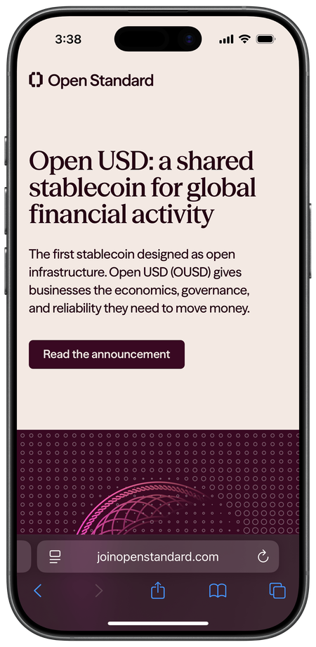
Open Standard on mobile
Since the mobile animations would need to be full-width with a 1:1 aspect-ratio, I decided it’d be best to start with the “hero” animation below the hero content, “straddling” the fold—this worked especially well for the initial ambient animation because it left the shadowy silhouette in partial view, which is extra mysterious and again encourages the viewer to scroll.
Scroll transition on mobile
Then, as the viewer scrolls, the hero animation transitions to the busy “problem” animation with its relevant copy below it. This mobile layout approach works perfectly because we then only need three standalone animations, and each one transitions to the animation that’s paired with its copy. The composable I wrote to handle the scrubbable scroll-based transition works regardless of viewport or device, so everything came together seamlessly for mobile (which almost never happens).
Easter eggs
With the main animation of the page wrapped up, I moved onto the final to-do on my list (and an especially crucial one)—easter eggs. Anyone familiar with my work at Stripe knows that I love to sneak in a few extra goodies in the final hours. This page in particular has four.
Mouse trail easter egg
Starting with the most obvious, I couldn’t help myself from using the dot system to include a throwback to the Flash days—a mouse trail. If you move your cursor around the dot grid, you’ll notice that the dots scale down near the cursor. And, a little less obvious, if you hold down the mouse as you move around, the dots scale up. This is especially fun if you move around the “problem” section with the mouse held down.
Globe trails easter egg
Less of an “easter egg”—and more of a “if you notice it”—once you scroll to the end of the globe animation, I include a tiny detail that places a cherry on top of the globe. After a brief moment, trail lines move across the latitudinal lines. These appear sequentially as they follow the axes of the globe. I felt like this would reemphasize the (seemingly) obvious fact that this is a globe, but also provide some activity to an otherwise static visual when at rest.
Now for a proper easter egg. Always remember to try the Konami Code on a landing page like this. During the prototyping phase, I remember coming up with an effect for the circuitry animation that looked cool, but was too much. Using a sine wave based on each dot’s distance from the center in the dot system, I achieved a sort of Twilight Zone effect where ripples appeared to move towards the center. The team loved the visual, but it felt too daunting, so I scrapped it. Then when it was time to sneak in a few easter eggs, I decided to bring back the ripples, but in a way that made more sense for the animation.
Ripple easter egg
Instead of rippling towards the center of the grid, I switched directions to ripple outwards. This immediately provided an “aura” effect that paired perfectly with the reveal of the coin, but also worked well with the other circular visuals, too. The circuitry animation is especially interesting with this ripple effect because it combines with the existing movement of the dots, so the ripples scale the dots in waves while the activity animation scale the dots downward.
Disabling ripples
One of my favorite parts of the ripple effect, though, is when you turn it off and the ripples dissipate into the grid of dots. I remember giggling to myself after seeing this for the first time. My wife asked if I was okay.
Logo easter egg
The last and final easter egg (I promise) actually lives outside of the animation—and it’s my favorite. I’m a sucker for subtlety. I love making things that you only stumble upon accidentally, especially when the first time is caught in the corner of your eye, like “wait, did you see that?” From the moment I started working on this page, I knew I wanted to interact with the logo. I didn’t know how at first, but then one night, I messaged Pete and asked if he could rotate the logo in 3D space and provide me with SVGs for each frame.
Later that night, as I sat there with a grin on my face, I told him to mouse over the logo. Using the frames he provided, I wrote an interaction that takes the velocity of the mouse and applies it to the frame of the sprite sheet. Then, if there’s no activity from the mouse, the logo eases to its nearest “resting” frame, so it looks like the original logo again. I live for these tiny, last-minute additions because they’re evidence that the people behind the page really care about every little detail.
It goes without saying, but an unbelievable amount of effort went into building this landing page. It also goes without saying that I loved every minute of it. The folks at Stripe really let us cook with this one, and the sense of camaraderie we developed as a team—and in such a short period of time—made the launch that much sweeter. A big thanks to Nick for reaching out; Jeter and Eryn for making it happen; Jonny, Dom, and Pete for jamming with me; Peter and Derrick for getting us across the finish line; and everyone else at Stripe whose fingerprints are on this page.