Cushion
Zooming into the schedule timeline
Over the past couple weeks, I’ve been focusing on the zoom functionality in Cushion’s new schedule timeline. At first, I considered holding off on this for the initial beta, but then I tried to think of which “zoom level” to ship with. I quickly realized that no matter which zoom level I launched with, a large number of users would find the timeline somewhat unusable—the year view is too zoomed out for day-to-day folks and the week view is too close for people with multi-month projects. This dilemma, combined with there being no rush, made me decide to sneak zooming into the initial beta. I can hear you thinking “scope creep, Jonnie”, but that’s okay because this is supposed to be fun.
At first, I started with a pinch gesture to zoom in realtime, which felt amazing and was a technical feat in itself, but after using it for a bit, I realized that this method of zooming wasn’t easily discoverable, and would be less intuitive for folks without trackpads. I do think there’s a need for a pinch gesture, but I don’t think it should be the primary way to zoom. Don’t worry—I definitely plan to write all about pinch zooming when I implement it, as it deserves an entire post to itself.
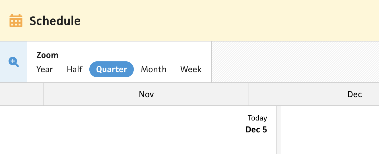
Setting aside pinch zooming, I kept it simple with a “Zoom” field that has options for zoom levels. The immediate visibility of this field lets the user discover that zooming is possible and provides them with the available options—all with a single click (or tab)! The field itself is a simple radio group using the CSS trick of hiding the input and using a input:checked + span selector (I’m targeting tags directly for the example, but don’t do this at home).
To handle scaling of the timeline, I provide a scale property that all the necessary children inject where needed—primarily for positioning. Under the hood, a single pixel represents a day at a scale of one, so the scale ends up being 3 for year, 6 for half, 12 for quarter, 36 for month, and 160 for week (e.g., a single day is 3px in the year view and 160px in the week view). At one point, I did consider scaling the size based on the width of the canvas, but I could easily see this being a nightmare when it comes to narrow widths. I might revisit the decision when considering mobile, as a “week view” with a 375px viewport does not compute, but maybe each breakpoint has its own scale system.
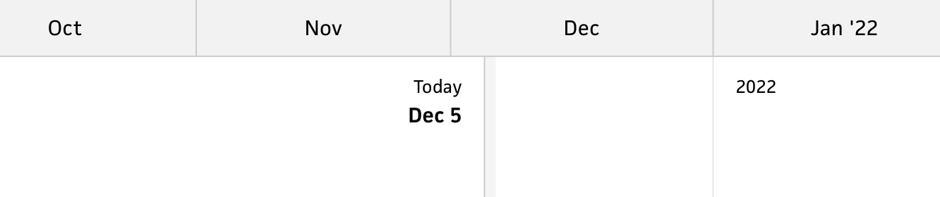
Once I got the scaling down, I needed to tackle the x-axis. Obviously, I couldn’t show month labels all the way down to the week view, so I needed to change the axes as the user zooms. In addition to the technical challenges involved, this also requires deciding what to show for each zoom level. For the year, half, and quarter, the choice is clear—stick with month labels. Once I zoom to a month range, however, I need a more granular x-axis.
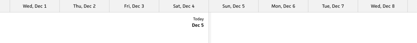
In the current schedule timeline, I show individual days in the month view, which is okay, but I think it might be too much too soon.
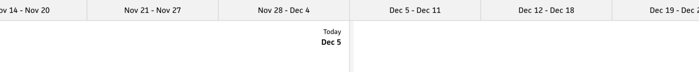
Instead, for now, I decided to show weeks with their date ranges. This might be helpful for folks who plan week by week. (I still need to render month dividers and potentially more vertical lines for alignment within the timeline, so bare with me on that.)
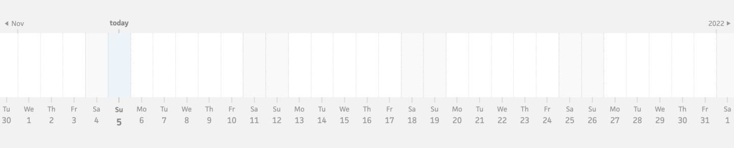
Since the new schedule timeline provides the week-based zoom level, which doesn’t exist in the existing timeline, this was my opportunity to use a day-based x-axis. The day-based x-axis for a week range lets me keep each label to 100px or above, instead of trying to squish too much into an axis. I definitely plan to include snapping to individual dates throughout all zooms, but the x-axis labels can still maintain a consistent size as folks scale the timeline.
Once I had a plan for the logic, I was faced with a significant technical challenge—transitioning between axes while maintaining buttery smooth performance. This was not easy, and forced me to attempt several techniques before I finally figured out the best direction.
At first, I tried using Vue’s <transition> element and a v-if conditional for each x-axis, but this approach unfortunately stopped scaling the x-axis once beforeUnmount was triggered, so there was a noticeable hiccup in the transition. In addition to smoothing the transition itself, the conditionals led to a performance hit as they meant recreating all the labels each time. Since I knew I wanted to bring back pinch zooming down the road, I knew I’d need a smoother approach that worked in realtime.
After spinning my wheels for a bit, I tried an approach that sets the opacity of each x-axis based on the scale. This provides a seamless, realtime fade between the axes, but performance was still a big issue—for example, if the week view is still mounted but hidden in the year view, it would still render all 365 days in the year and scroll/zoom those, too. The fix for this wasn’t pretty, but it was reasonable.
If an x-axis is at zero opacity, I use v-show to take it out of the display. Then, within the x-axis components, I clamp the scale for each axis to the scale range in which its visible. For example, the week axis’s scale is clamped between 12 and 160, so the axis will only render labels for those scales. I also prevent render updates when an axis is fully hidden, so there aren’t any phantom computations. Combining all of these considerations results in the most buttery zooming you’ve ever seen!
From here, I do plan to re-add pinch zooming, but I believe it can wait until after the beta has launched. I need to draw the line somewhere, and the pinch gesture definitely falls under the category of nice-to-have. The goal with this beta is to launch a schedule timeline that’s useable, but still has lots of room for feedback. I’m considering this initial release to be a simplified “read-only” version of the timeline, with much more in store down the road. Stay tuned!