Cushion
The timeline
I spent most of the day staring at the screen, thinking. I flipped back and forth between the Cushion prototype and the design flats, figuring out what to work on next. The timeline section at the top hadn’t received much love, so I focused my attention there.
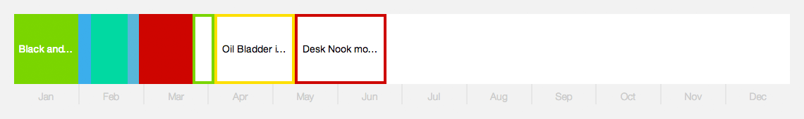
The timeline is terrifying because it’s going to be a challenge to make it look good with real data. Based on my personal usage, it looks great, but only because I’ve been lucky—working on projects that make it look great. Once I added random data that scales between very low-budget projects to very high-paying projects, it turned into fright night.
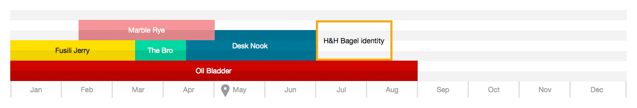
The biggest problem is the width of each project and the logic that will go into showing or hiding the label. For freelancers who work on dozens of projects in a given month, like illustrators, projects will probably never be wide enough to show the inner label. Because of this, I’ll rely on the color of the bar and maybe show a tooltip label on hover. As an in-between measure, I could also add a “symbol” attribute. This way projects like Kramerica’s Oil Bladder would show “K” for the client and “OB” for the project.
I also plan on having multiple zoom views for the timeline, so projects won’t always feel so crunched. The initial view shows the entire year, but you’ll be able to focus in on a given month or quarter. This will spread out the projects and probably be the more common view for freelancers who work on shorter-term projects.
The timeline section has so much potential because I can build so many different views into it. The early designs included everything from planning projects per days and visualizing overlap to grouped income by project type. I can’t wait to flesh it out some more and continue fine-tuning it based on real data. I’m determined to make the final result really solid and able to handle any use-case.