Cushion
The new account page is live
On the heels of last week’s launch of the new invoice page, this week, I rolled out Cushion’s new account page (and so much more)! There’s a lot bundled into this update, like a new design system, new component library, new subscription and billing system powered by Stripe—it goes on and on and on. (Between us, the account page itself is actually a facade for all the real updates, but shhh…) The main goal for this launch was to bring the new systems into production with a secondary goal of migrating to Stripe’s new SCA-ready products—primarily Stripe Checkout for creating subscriptions (ironically, a marketing page I recently worked on at Stripe) and the Stripe Billing customer portal for managing subscriptions, payment methods, and receipts.
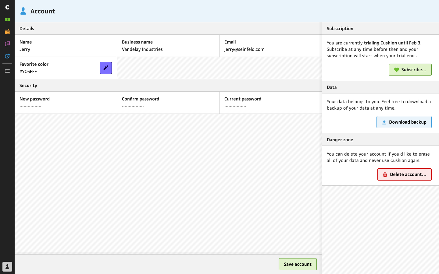
Cushion’s new account page
Now that Cushion has the new front-end system in production in the form of the account page, I have a solid blueprint for migrating the rest of the app. They’re able to run peacefully side-by-side by pointing the existing app’s routes to the existing app, as it’s been doing for years, but as soon as you navigate to /account, Cushion leaves the single page app for the new one, which currently only handles the /account route. This is a great starting point for adding new routes, and as I add more routes to the new system, the navigation between those routes will be much smoother than the clunky full page load between the existing and new apps.

Cushion’s old “customer portal”
If you’ve been using Cushion for a while, you’ll notice how lean the account section is now. Previously, it housed the account form as well as sections for comparing plans and another section for managing your subscription. I’m still proud of myself for building out my own custom “customer portal”, but time spent on that meant time away from building Cushion’s actual features. Now that I hooked up Stripe’s customer portal, I can hand off all that work, maintenance, and regulatory compliance to them. I can also delete a massive chunk of Cushion’s codebase in the process. The only part I need to retain is indicating which subscription a user has, so I can point it out in the UI.

Cushion’s old plans page
As for the plans section, this is now part of the subscribing flow rather than an always-accessible section. I mentioned in a previous post that having the plan breakdown in two separate codebases (the app and the marketing site) was a massive annoyance to me because changing one required changing the other. To make it worse, the marketing site’s audience was potential users, so it had to show certain things while the in-app section’s audience was new users who are considering subscribing. And to put even more work on my plate, I felt obligated to show legacy plans for legacy users, which meant continuing to maintain the plan comparisons for all plans ever. (deep breath) I didn’t exactly make it easy for myself.

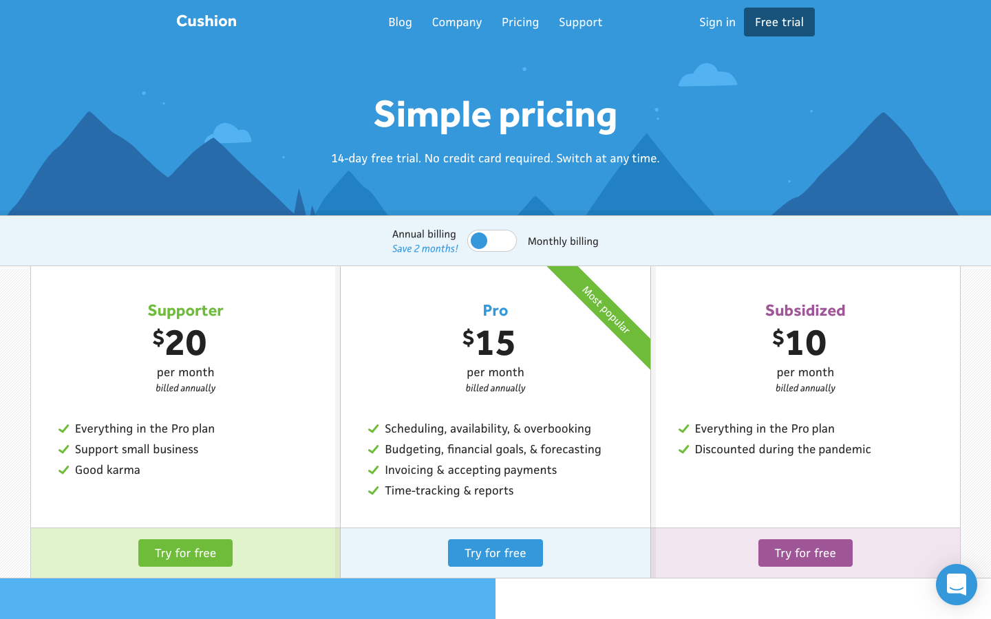
Cushion’s new plans page
Because of all that, I made sure to do it the right way this time by managing both the in-app plan comparison and the marketing site’s pricing page from the same easy-to-update CMS. Both pages also share content, so if I tweak the wording for a plan, I don’t need to remember to update the other. Users land on the plan selection page after clicking the subscribe button from the account page. The buttons for these plans create a Stripe Checkout session for the given plan.
Cushion’s new pricing page
Meanwhile, on the new pricing page, those buttons take the user to create an account. Along with the different button actions, I actually differentiate the FAQs between the two pages. For the in-app FAQs, I focus on subscription-specific questions, since the user has already tried out the app. On the pricing page’s FAQs, I include questions about the trial and high-level feature questions, like whether Cushion has a mobile app or a public API. Sadly, the answer to both is no, but I’m only one person for cryin’ out loud!
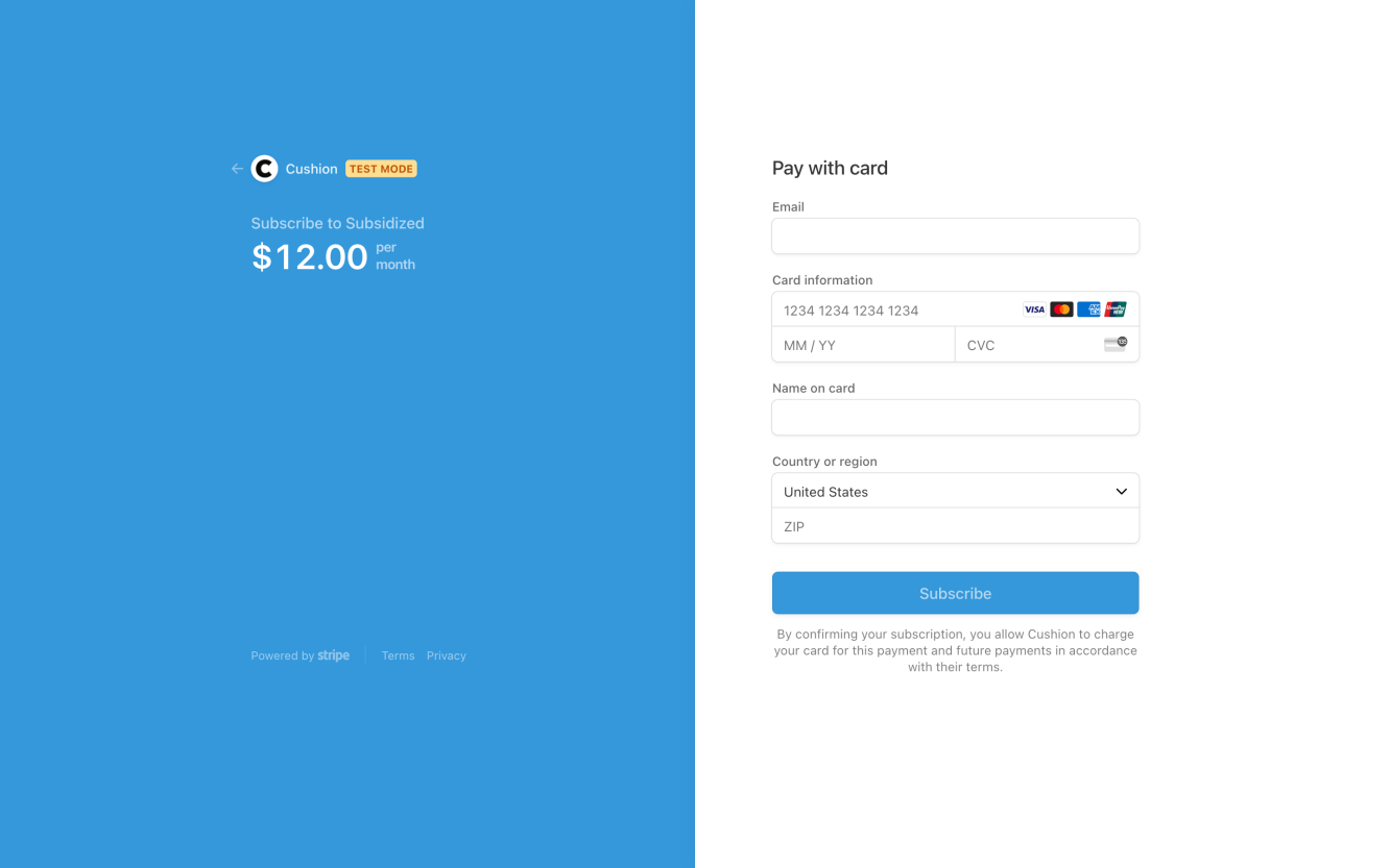
Cushion using Stripe Checkout
When the user picks a plan, they’re redirected to Stripe Checkout to enter their billing info. For full transparency, there was a time-sensitive aspect to this launch because Stripe Checkout is SCA-ready. By implementing it by the SCA deadline of Jan 1, specific charges from European users won’t potentially fail because my previous system didn’t support SCA. That’s a big relief for me, but probably snooze-fest for anyone else. A more exciting addition is the support for Apple Pay and Google Pay we get for free simply by using Checkout. No more fishing for your credit card—just scan your fingerprint for the robots!
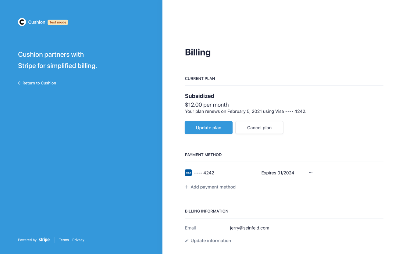
Cushion using Stripe Billing customer portal
Once a user becomes a subscriber, they can then manage their subscription, update their payment method, and download receipts from the Stripe Billing customer portal. This truly gives me peace of mind to know that I don’t need to handle this anymore. It can live outside of Cushion, and I can remove tons of code from the codebase. Any time I can do that, I’m happy.
The last part I’ll mention is that this launch includes new plans. As mentioned in this post, I’ve decided to do away with plans that lock or unlock certain features, but instead offer the same fully-featured plan at different prices. For folks who really want to use Cushion, but can’t justify the cost during the pandemic, there’s the Subsidized plan. For others who want to support Cushion even more, there’s the Supporter plan. Otherwise, there’s still the Pro plan. Hopefully, this helps out a bit until everything is back to normal.
That’s a wrap for this launch. I have a few fast-follows on my plate to tackle right now, but check out everything and let me know what you think. I can’t help but feel like this is the first big step towards the Cushion I’ve always dreamed of.