Cushion
Responsive images for different layouts
I made a ton of progress on Cushion’s homepage this weekend, focusing mainly on the feature zigzag. Each feature section focuses on one of Cushion’s main features, like scheduling, budgeting, etc., and includes an accompanying image to represent that feature.
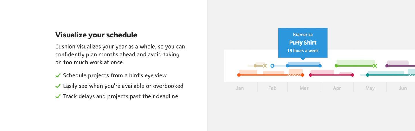
Most of the images depict one of the timelines in Cushion, so they’re super wide, but I anchor them to a side and crop the rest. In previous versions of the site, when reflowing down to mobile, I’d simply continue cropping and let the browser be the designer, no matter how unfortunate the focal point. This time, however, I decided to take advantage of the <picture> element, and swap out different images for different breakpoints. This lets me focus on the best part of the image at a given crop or change the actual image for a given size.
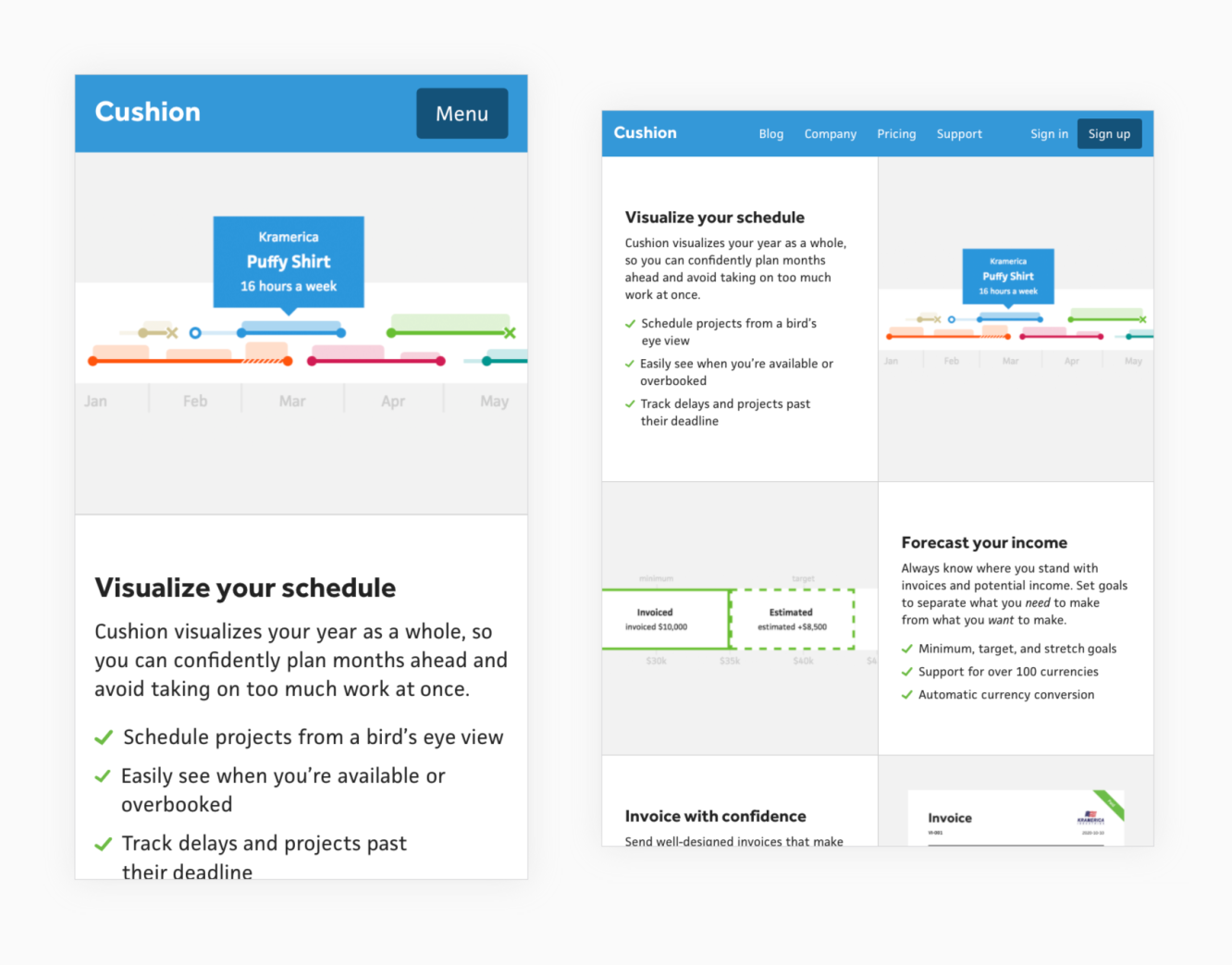
The design for this section of the homepage starts stacked on mobile, then switches to a two-column at 750px—my designation for tablets in portrait orientation. Without derailing this post too much, in the past year or so after reading this article, I’ve switched from device-specific breakpoints (like 768px, 1024px, etc) to breakpoints that are divisible by 300px (or 150px if I need to be more granular). Aside from being a bit more flexible and less device-specific, the biggest advantage for me is the ability to mentally recall and associate these values to a given range. I also don’t use SCSS variables to represent these breakpoints with names—I simply use pixel values. This probably isn’t best practice, but the purist in me appreciates seeing the CSS as vanilla CSS—if you ignore the nesting.
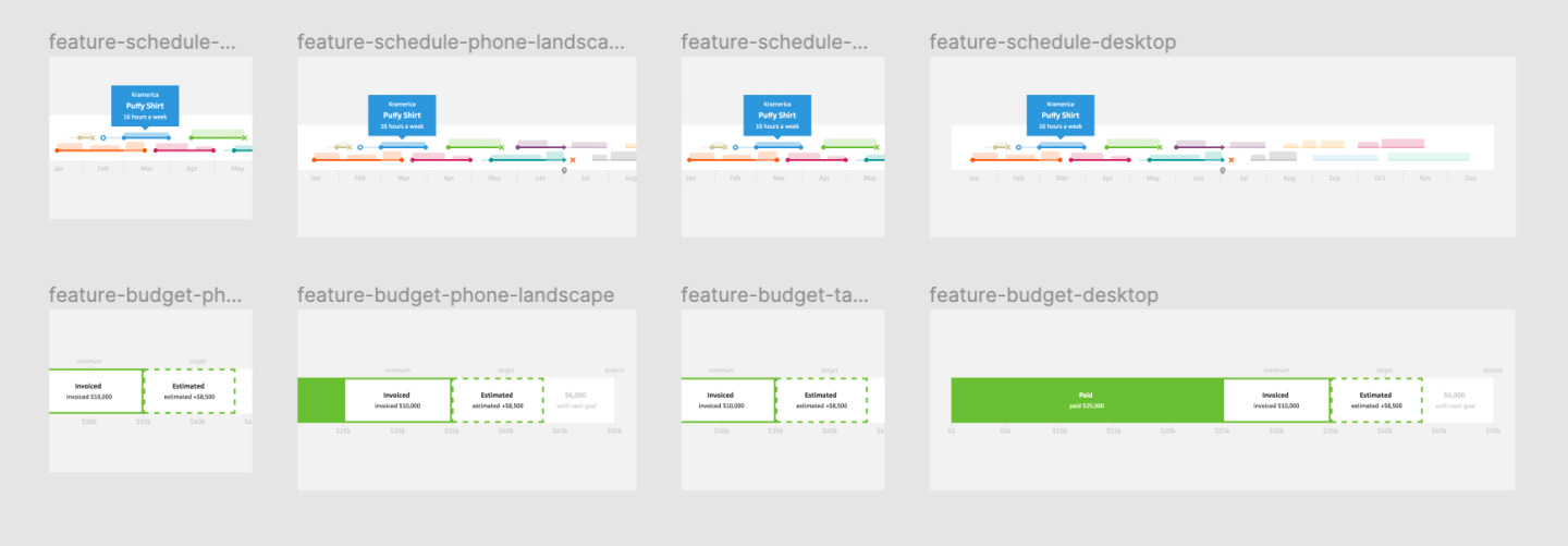
Because the layout changes between breakpoints, I end up with image areas that go from square to landscape to square to landscape. This is absolutely terrible for getting a single image to look great at each breakpoint, so I decided to create specific images for each breakpoint. In Figma, I created a frame per breakpoint to best fit the image area, then fit the original image to the frame, scaled it, and focused on the most relevant part. For most of these images, I now realize I could probably take advantage of Contentful’s images API to crop the image to a given area, but there are certain images that I actually end up changing based on the breakpoint.

For the invoicing section, the image shows Cushion’s invoice page with the pay buttons on the right. This looks great on landscape aspect ratios, but when the image is within a square frame, it scales the invoice too much. To remedy this, I removed the pay buttons for square images, so the invoice goes full-width minus the margin. At first, this lacked the pop of color that the pay buttons provided, so I added the “Paid” badge to the invoice to bring the color back.
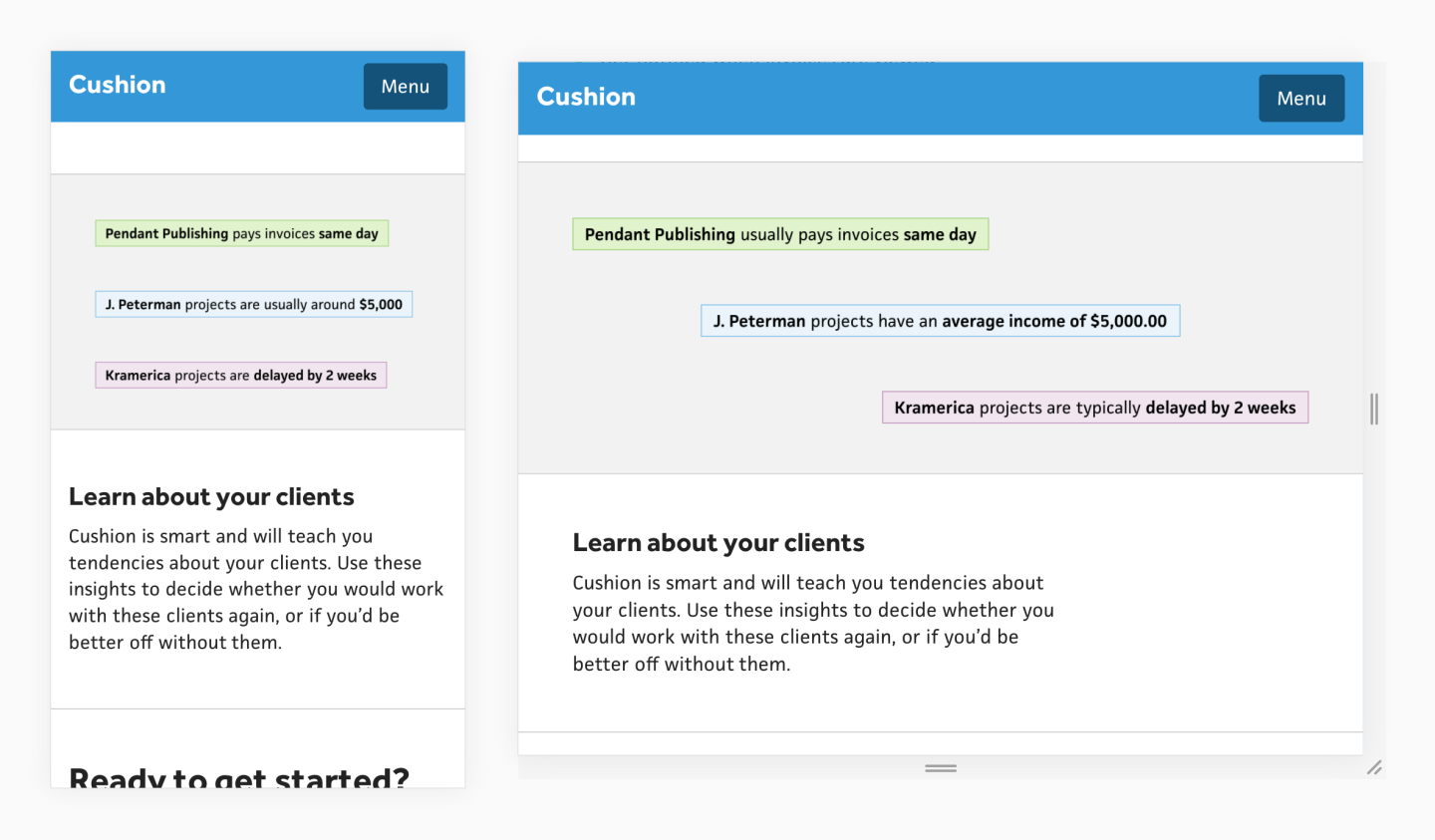
For the client insights section, the image itself is meh. I don’t love having a text-based image, but that’s what the insights are, so it’s best to accurately show them rather than some illustrated representation of insights, like an oddly shaped person looking at a document with a magnifying glass… <sighs>trends</sighs>. Because the insight text varies in lengths, they also face the challenge of a changing aspect ratio. For this image, I mainly switch between left-aligning the text and right-aligning to text based on the layout, but for the phone landscape breakpoint (450-750), I actually spread the text across the image in steps. This makes the most use of the space without leaving an awkward negative space.
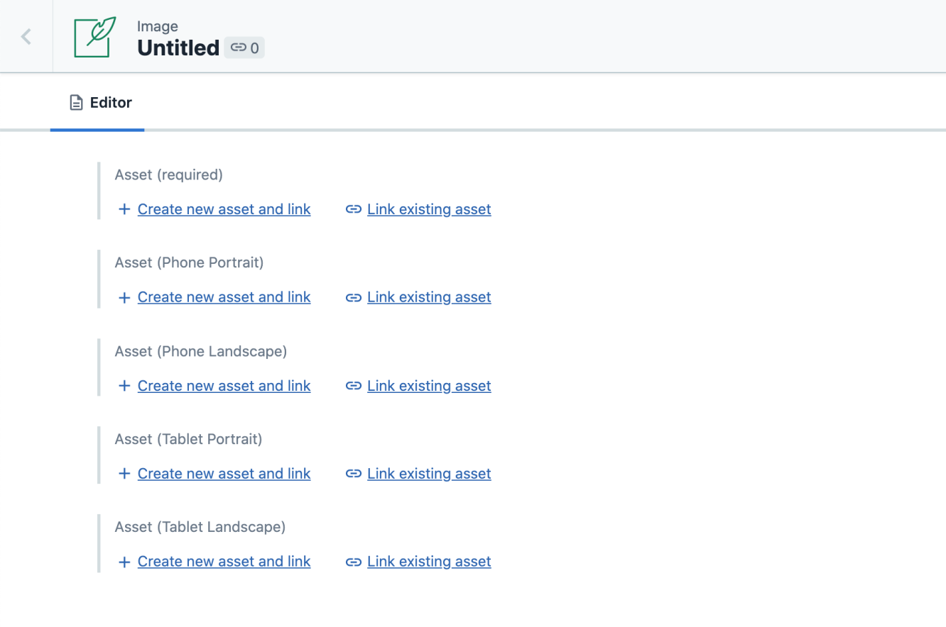
In the CMS, I now have a content model for images with a single field for the asset, then optional asset fields for each breakpoint. If one of those images doesn’t exist, I fall back to the original asset, which ends up being the same as the image for desktop. Despite not using names for my breakpoints in the media queries, I do name these images. I think this is okay because I’m only talking about the range—not dealing with any min/max/only.
And that’s it! Now, I have images that look great from desktop down to mobile without any awkward breakpoints. In the past, I’ve used html:<picture> for swapping out a smaller resolution image for smaller screen sizes, but this approach of completely changing the image to better fit a certain aspect ratio really excites me. From now on, I’ll be thinking about images in terms of assets-per-breakpoint rather than a single image designed for them all. This also has me buzzing about the possibility of swapping in an animation for certain breakpoints and otherwise falling back to static images. In any case, I’m almost finished with the new homepage, so keep an eye out!