Cushion
Redesigning the invoice line item footer
For the past few weeks, I’ve been working on a new invoice form in Cushion. After the new account page, it’s my next step in migrating the app to new frontend system, including both design and stack. While I’ve already made significant progress on the form (unfortunately without writing about it), the most recent accomplishment was enough of a challenge that I couldn’t continue without mentioning it—the line item footer.
Before I dive in, I feel like I must preface that the current invoice form is one of the oldest parts of Cushion. I believe it’s either six or seven years old at this point, so it has certainly stood the test of time, which is why I haven’t been in any hurry to redesign it. I mention its age because, to me, it stands out like a sore thumb. When I look at it, I see 2015. Based on its positive feedback, however, I assume few others notice its age, but I do, which is why I’m writing this preface.

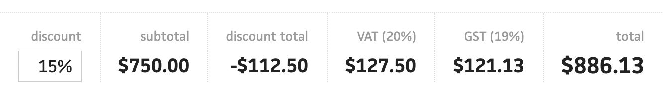
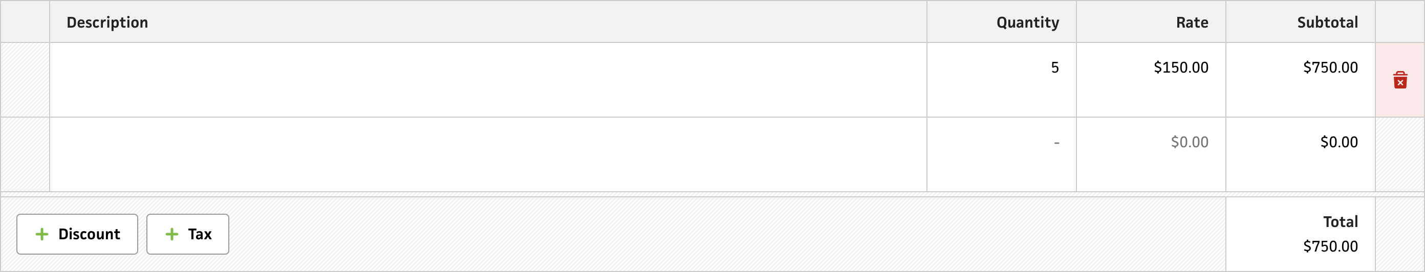
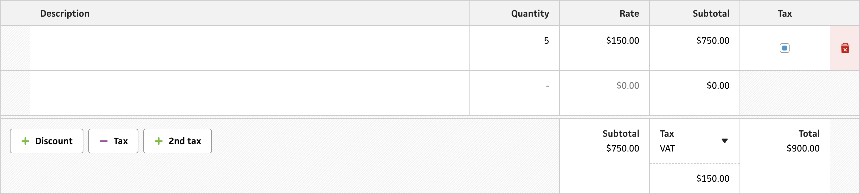
The footer of a simple invoice
The footer of a complex invoice
Now, the line item footer has many variations, based on how many “extras” an invoice might have, like discounts, taxes, etc. Because of this, it ranges from simple and straightforward—with a single total—to complex yet thorough if it has taxes and a discount. Since a large majority of Cushion’s user base is located in the US, I can assume that most folks will only ever see the simple, tax-free appearance with maybe an occasional discount. For the rest of the world, however, tax is pretty common. Since I love all of my users (❤️), I need to make sure it looks great and works well regardless of the invoice’s complexity.

Starting with the parts that do work well in the current design, I like that the discount field is right next to the total and easily accessible. My only gripe about it is that as soon as you enter a discount, the discount total appears and moves the discount field from its existing spot—a major design peeve of mine. Going forward, I’d much rather keep items in their place as the user interacts with them and avoid those surprise UI twitches of showing/hiding elements.
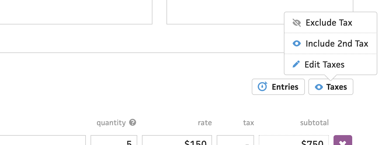
As for the parts I don’t love, they all revolve around the tax fields—the complexity culprit. Trying to remember back to 2014/2015, I guess that I liked menus a lot more than I do now because I hid everything tax-related in the “Taxes” button/menu. That’s where I let folks show/hide the tax fields and edit preset taxes. Small elements like the “Taxes” button are easy to miss when dealing with a potentially complex invoice form, so I’d prefer to be more direct by using first-class toggles.
As a brief aside, I realized that I added considerably more complexity to both the form and the backend by allowing not only specific taxes per line item, but also custom taxes that aren’t tied to preset taxes. Essentially, someone could create an invoice with different taxes on each line item, and Cushion would support it. Considering Cushion’s mostly US user base, that’s wildly unnecessary and could easily be simplified by letting each line item simply indicate whether or not to apply the tax. And, that’s what I plan to do.
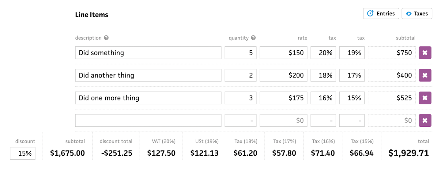
Looking at the new design, which uses the new grid system, I now have a set of buttons on the left for adding a discount and/or taxes. At first, I positioned these buttons next to the total, but this broke my rule of moving UI when interacting with it—adding a discount would insert the discount field and shove the buttons to the left.
If we zoom out, you’ll see that the new design spans edge-to-edge, which might be borderline too much room, but I’d rather provide ample space than not enough—especially as folks add more columns that condense the description field.
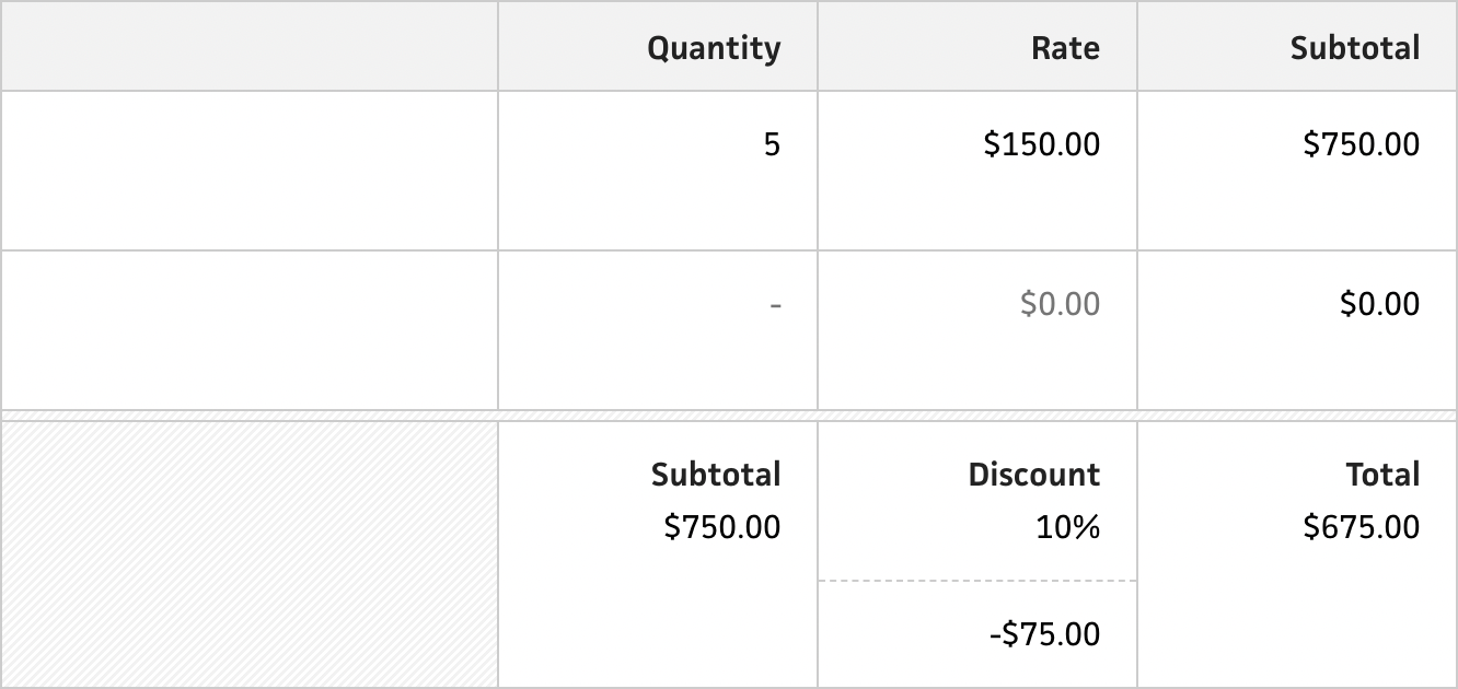
When the user clicks the discount button to add a discount, the field appears next to the total along with a subtotal. The subtotal tallies the results of the line items before applying the discount, so there’s complete transparency over the math for each step of the calculation. You’ll also notice that the discount percentage field has its own currency field below it. This shows the amount of the discount, so the user can again follow the math. The discount’s amount increases the height of the footer, which actually works out in our favor as it brings more space and emphasis to the subtotal and total.
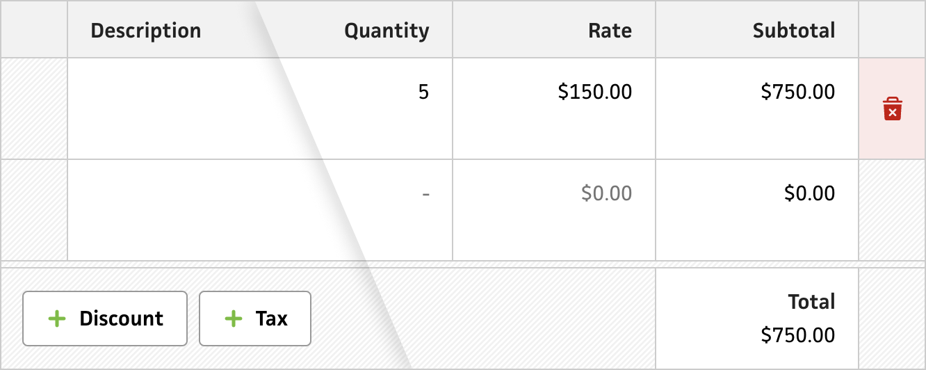
I actually spun my wheels narrowing in on this layout after trying out a handful of different approaches, like the ones above. In the first one, I try right-aligning the dropdown fields and using a flat shadow to show some depth, but it felt unnatural. Then, I tried using a dashed line, but reversing the fields with their totals. This works really well for base-aligning all of the dollar amounts, but it makes the input fields feel secondary, so folks would more likely think they could interact with the discount dollar amount vs the percentage.
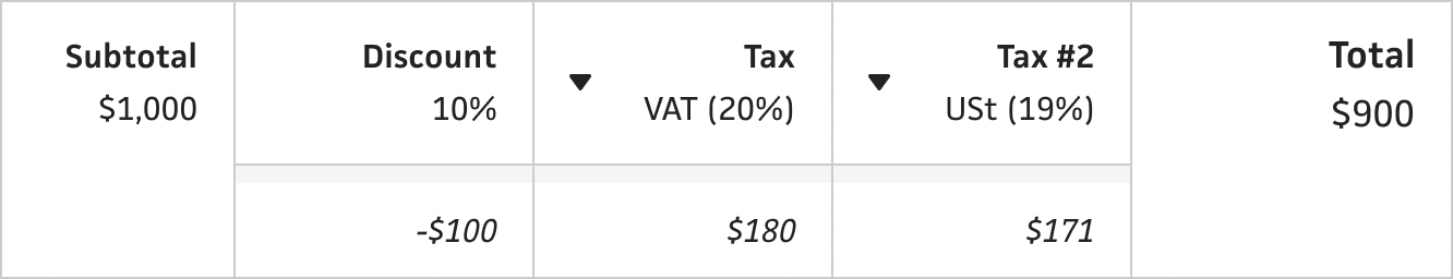
For taxes, toggling the tax button shows a tax field with its total and displays checkboxes for the line items. At the moment, the checkboxes are squares with rounded corners, but I plan to replace these with proper green checkmarks to make it crystal clear that these are checkboxes. To maintain the grid, I widen the checkbox to match the total field below the line items. This looks somewhat weird, but it looks even weirder if the gridlines don’t line up. It makes more sense when you toggle the 2nd tax.
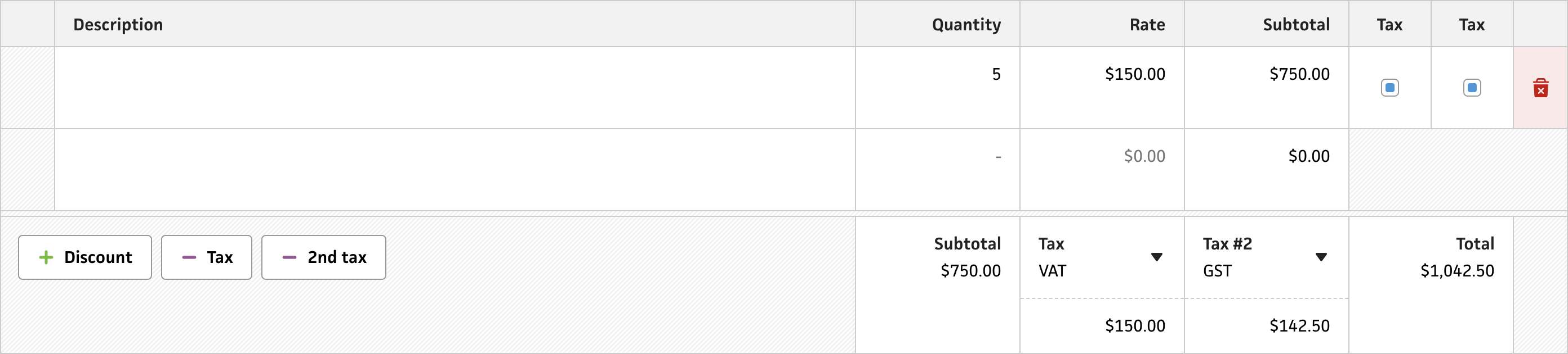
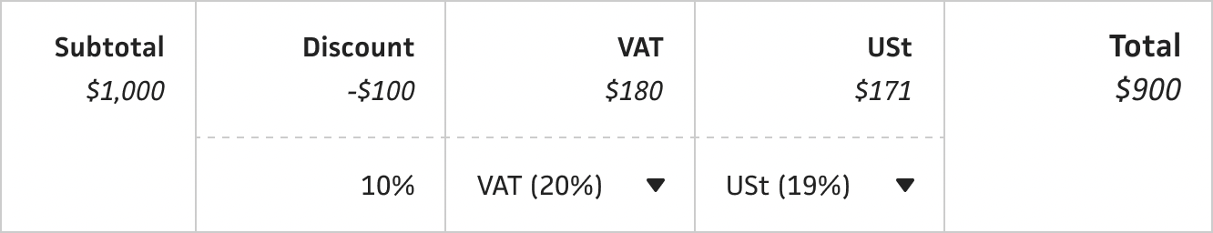
Speaking of toggling the 2nd tax, this option becomes available after toggling the 1st tax, so we don’t clutter the button area too much. When toggling the 2nd tax, it adds another tax field with total, but squeezes the 2nd checkbox into the same space as the first checkbox. This again helps maintain the same grid alignment with the total below. Though it’s not reflected here, I have a to-do on my list for the tax column labels to use the actual tax names, like VAT, etc., which will make it much easier to associate the relevant tax with each checkbox.
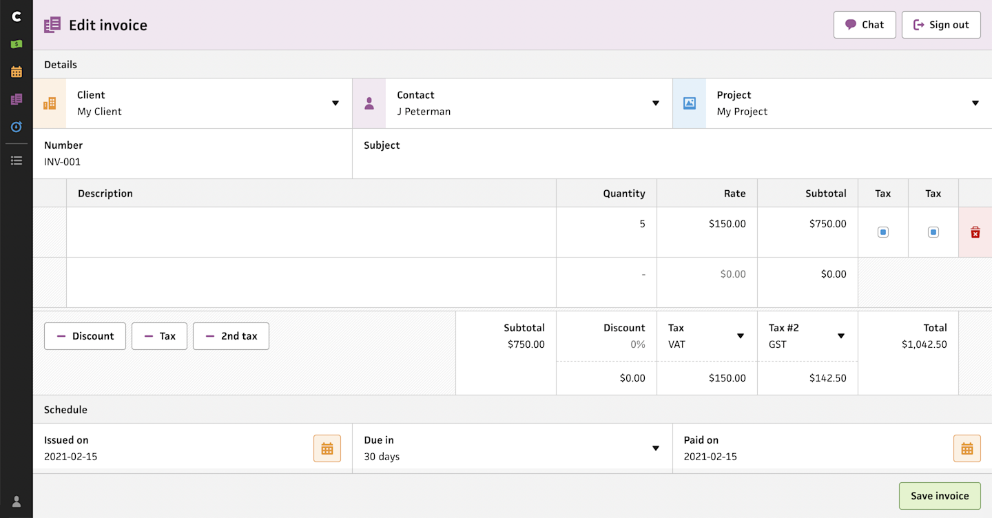
Zooming all the way out, you’ll see that even with all of the extra fields enabled, there’s still plenty of space to work with. This will go a long way when adding the ability to have specific projects per line item. I’m also reserving those 48px-wide spots on the left for drag-and-drop reordering of the line items—a feature that’s been requested since the dawn of time.
Phew. That was a lot, but I really appreciate you staying with me if you made it this far. While I still consider this invoice form to be the right next step for migrating to the new system, there’s so much involved with making that happen. It requires a massive amount of persistence, patience, and determination, but it’ll be worth it. I’ve been at this for seven years, so what’s a few weeks, anyway?