Cushion
Preferences, accounts, and typeface change
These past couple weeks, I’ve been focusing on making Cushion feel like a legit app. To me, this entails adding all the little parts that can be easily skipped early on, like the ability to change your password. For a public app, these are essential, but in my eyes, you can go without them for a week or so when holding a private beta.
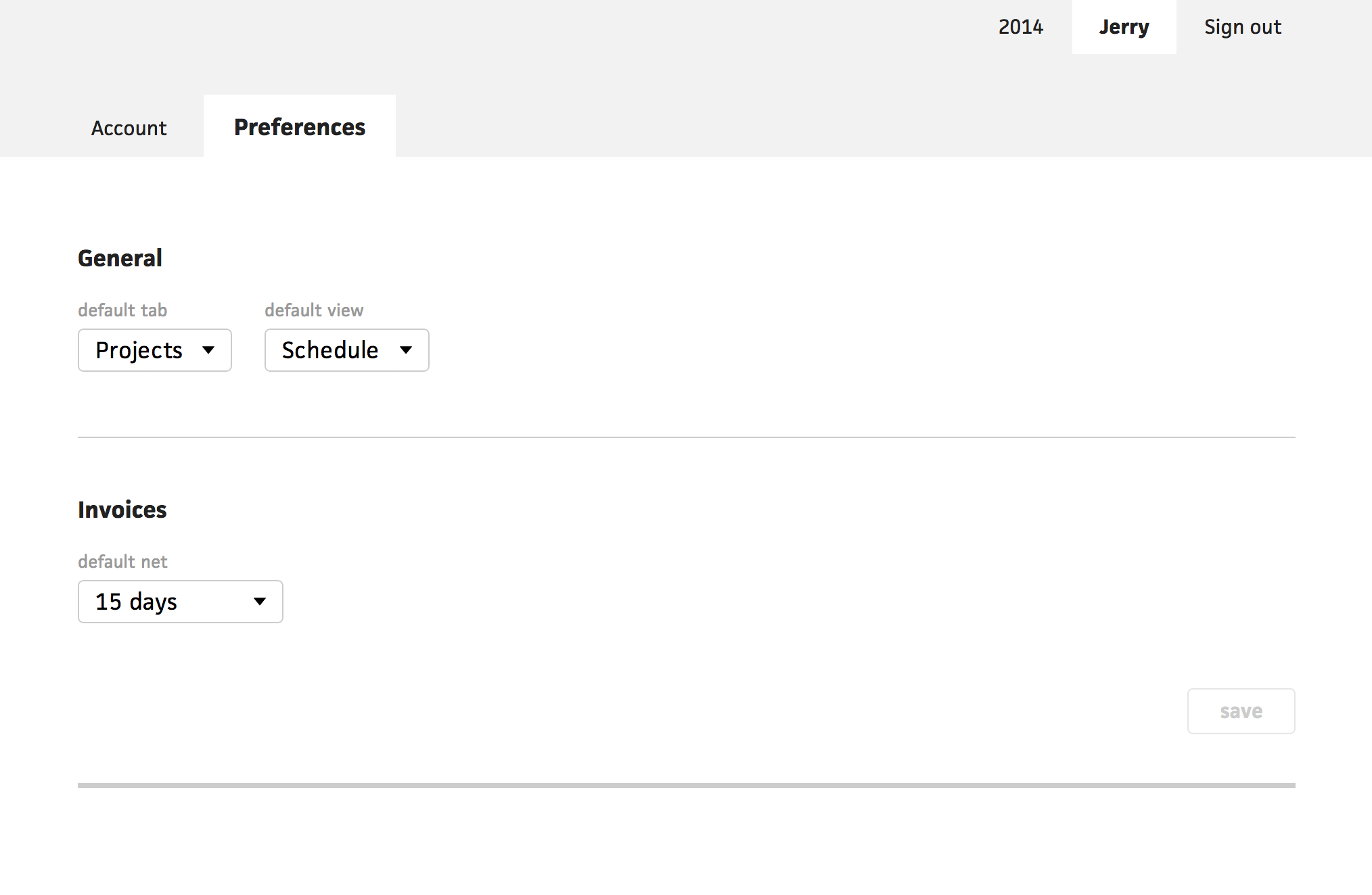
Alongside smoothing out the experience, I started building in convenience features, like preferences. Since getting Cushion in the hands of others, there has been an obvious need for certain defaults, so when a user fills out a form, they don’t find them setting the same value on the same field every single time.
The most apparent of these fields was the invoice’s relative due date, or net. Most freelancers use the same net for every project and they all vary in generosity, from “net 30” to “due upon receipt”. Now, I have a preference for this field, so whenever the user creates a new invoice, the net is that value by default.
With new additions, it’s good to hold back from implementing them until you have at least two examples to use. For example, I wouldn’t add a preferences section if I only had this one preference. That’s why I added two more—default tab and default view.
For me, the projects section with the schedule view is the page I use the most, but this isn’t the case for everyone. If you’re less about scheduling and more about accounting, you might live in the invoices tab with the budget view. With these new default tab and view preferences, any time you switch from the account/preferences section of Cushion back to the timeline section, it will take you to your default.
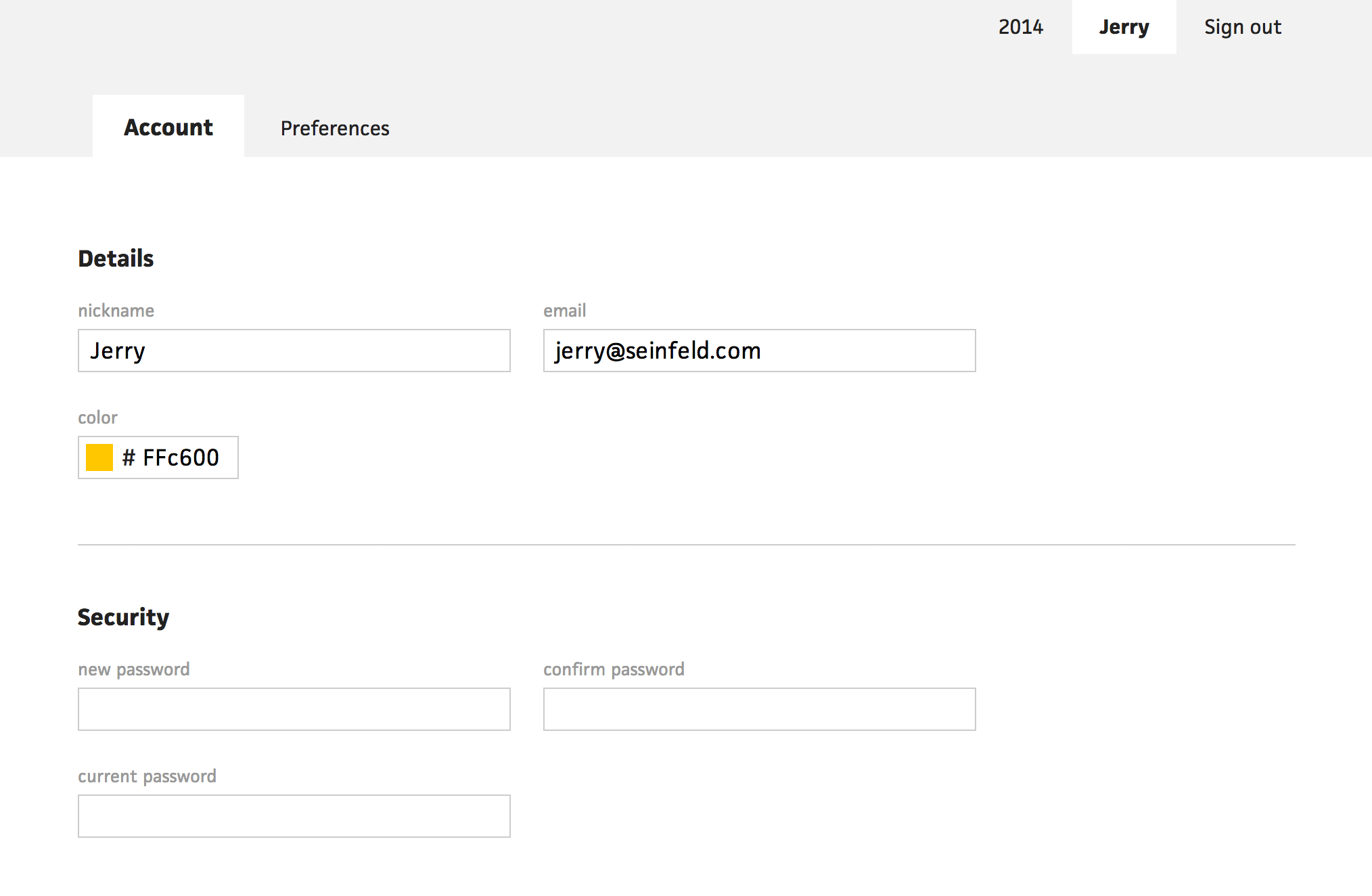
Speaking of accounts and preference, I don’t think I ever mentioned this second side of Cushion. From the beginning, users have only had access to the timeline section, which consists of the client, project, and invoice tabs. Now that I’m adding all the necessary parts of a real app, I established a top level navigation for switching between the timeline section and the account/settings/whatever-you-want-to-call-it section. This navigation system works pretty well so far, allowing a new set of view level tabs for switching between account information and preferences. For now, these are the only two tabs, but eventually, we will have a few more for hooks and integrations—the fun stuff.
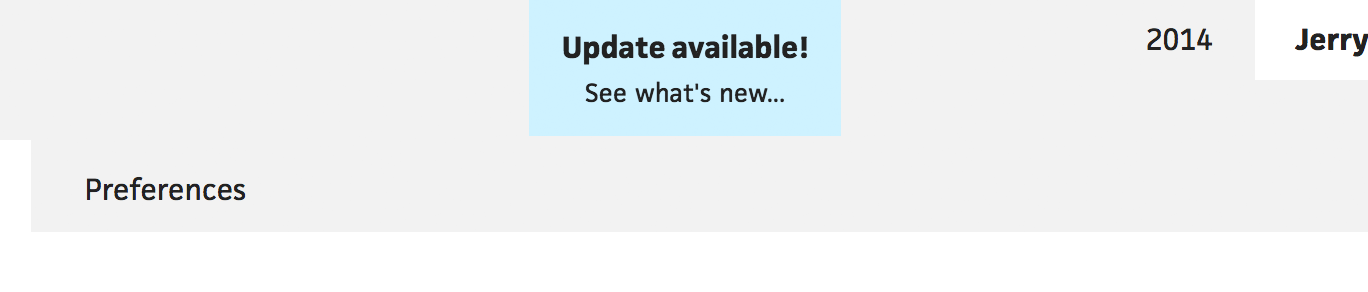
Tacking onto the legitimacy of Cushion, I built a dead-simple update notification alert for users to know when I deployed a new version. It slides in from the top, just like success notifications, but it’s blue and refreshes the page upon clicking it. The downside of a web app is that a user only sees what they loaded last. This means, if they haven’t refreshed the browser in weeks, which has happened with past apps I’ve worked on, they will be using an older, potentially incompatible version.
I didn’t want to be wasteful and poll for changes. Instead, I decided to use a custom response header X-App-Version with each API response. This value is an environment variable that I set after deploying a new version. Because the app checks the difference upon receiving a new response, like switching views, we won’t experience any of the issues we’d see from something like refreshing upon a date change—the alerts are spread out more.
I’ve been on a few betas that also use an update notification, but I noticed that they often forget to include what’s new. I get excited for updates, but then I need to spend a few minutes digging through the app, looking for changes. For Cushion, I created a new changelog page, which the alert links to. The changelog runs on the same static system that this journal runs on, so if I spot a typo, I don’t have to prompt the user of an update by deploying the change.
The last bit of progress I’ll cover in this post is the obvious font change. I’ve been keeping this in the back of my mind since the beginning, knowing I would need to eventually pick one other than Helvetica Neue. After literally hours of switching between several fonts and just staring at the screen, I decided to go with Facit by Just Another Foundry. The decision was tough, but in the end, I picked Facit for its personality, solidity, and beautiful italics.
The typeface has a very wide range of weights, which work incredibly well in Cushion’s interface. I’ve been able to find areas in Cushion that benefit greatly from a variance in thickness, like the timeline tooltips. Overall, I think like Facit gets me closer to that solid, reliable feel that I want users to experience when using the app.