Cushion
Plugging in real data for the first time
I recently sat down with a friend who has shown interest in Cushion since I first mentioned it. I gave her a demo, but we also set up an account for her and plugged in all of her data—clients, projects, and invoices. I was both amazed and thrilled that she would let me input her real data even after suggesting we use dummy data for privacy. I’m glad we used the real data because her data instantly revealed a dozen issues with the current version.
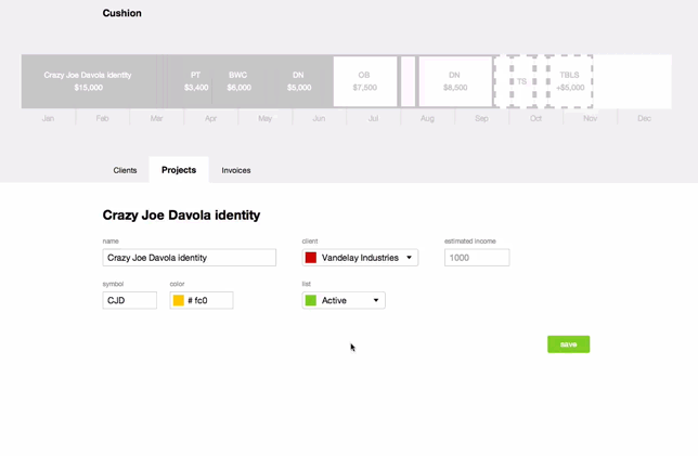
For one, she doesn’t have a single client with more than one project. This became a huge issue as we constantly needed to jump back and forth, creating a client, then creating a project. It felt uncomfortably redundant. Because of this, I added a "New client" option to the client dropdown in the project form. Selecting it adds a few extra fields to the form, so you can also create a client there with a single click. The input fields also use the project fields as default values, so you don’t need to set the same color twice if it’s the same as the project.

The second major issue I discovered was sequential timeline items that shared the same color. It was difficult to see the edge between them, but also, smaller projects would easily be lost without a label. To fight this, I added a very thin, transparent line to the edge of each item. It’s dark enough to show a separation without too much contrast. Even though I’m a sucker for full fills of color, I actually love the look these lines provide. The timeline feels much more solid.

Along with the divider, I finalized the hover state of the timeline items for when a label collapses to its abbreviation. Prior, I would show a tooltip-like element above the item and call it a day, but after adding the divider line, I decided to dim the item behind the tooltip. With the smaller projects, this really makes it clear as to which project you are hovering.
The third and final problem I’ll point out is the timeline’s inability to handle tiny items. For example, if your timline is set up with a goal of $100,000 and you have an unpaid invoice of $100 for a friend project, it should show up as the tiniest of slivers. Unfortunately, a CSS border forces a minimum width of twice the border width, so a 4px border would make any item at least 8px wide. I got around this by using the CSS outline instead. It allows the same controls as border (except for sides), but doesn’t have a minimum width.
I hope to have more in-person demos in the coming weeks, so I can find even more of these issues. It’s an incredibly valuable learning experience for me.