Cushion
Flattening the nav
In a recent post, I wrote about striving for a single click to get to where you need to go in Cushion. This came out of a frustration with the app’s current structure where clients and projects are strangely buried within the schedule and budget sections as tabs within subsections, rather than their own top-level sections. Correcting this means extracting the client and project sub-tabs into their own sections, but the more ambitious side of me wants to go a step further—flatten the entire nav. If I could simplify Cushion’s nav to the point where it’s a single layer, I could achieve the single-click goal that I dream about while also resolving the widespread issue that Cushion is complex to navigate. Let’s dig in.

There are currently three core sections in Cushion’s nav—“Schedule”, “Budget”, and ”Track”. Within the “Schedule” section lives two subsections—“Planning” and ”Bird’s Eye View”. This last one is such a strange name for a section of the app, but if you’ve used Cushion, you get it. When I wrote about validating assumptions, I mentioned that the separation of the “Planning” and “Bird’s Eye View” sections might be the reason that few people use workloads in Cushion. It might also be that they’re too fine-grained for Cushion’s typical user or that the manual process of adding them is too much of a chore, but in any case, I’ve always thought these should be a single graph. In an ideal world, which involves ignoring how we get there, let’s say I can combine these. That gets the “Schedule” section to be a single level without two separate subsections.
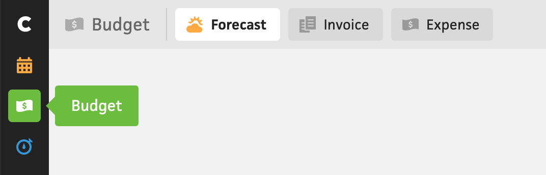
The “Budget” section, which is Cushion’s premier section, has three subsections—“Forecast”, “Invoice”, and “Expense”. Also while validating my assumptions, I confirmed that expenses is by far Cushion’s least-used feature. This isn’t shocking—it actually makes perfect sense. Cushion will never compete with a service like Quickbooks or Expensify, which are tethered to your bank account (and accountant), but I’m also not trying to compete with these services at all. Expenses were simply a way to tell the other side of the story with budgeting, since Cushion was only looking at income up until that point. I came to realize that that’s okay, though. Most freelancers already have an accounting tool taking care of their expenses, so Cushion serves the purpose of being a “casual”, high-level look at income. With that in mind, if I can hide expenses for new users, I’m down to two subsections for “Budget”.
“Invoice” is an easy one because I also learned a valuable insight from my recent database analysis—an overwhelming majority of active subscribers rely on invoicing in Cushion. In fact, it’s the most-used feature. Then why on earth is it buried as a subsection? Based on my analysis, I can easily justify promoting “Invoice” to a top-level section—it truly deserves the recognition. That gets the “Budget” section to the flat, single-click section that I’m after.
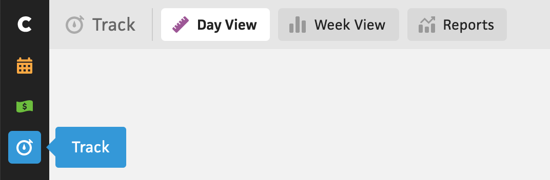
Last of the top-level sections is “Track”, which is where time-tracking lives in Cushion. This section’s subsections are actually just different zoom levels of the same data—“Day View”, “Week View”, and “Reports”, which zooms between month, quarter, and year views. Now, I don’t have a super solid path forward here, but rather an idea to explore. What if these subsections were replaced with actual zoom levels? You can track time at the day level, then zoom out to a week/month/year view and export a report if you need to. Similar to the planning view, it seems strange that you can only export data from the “Reports” section, which only shows month/quarter/year zoom levels, but you can’t track time there. In a combined view, you’d be able to export data and track time from any zoom level. I mean, think about how cool and unusual it’d be to track time in a year view!
If I’m able to make this work, Cushion could have a flat top-level nav consisting of “Schedule”, “Budget”, “Track”, and ”Invoice” for the core features, then “Clients” and “Projects” for the admin-related area. With “Clients” and “Projects” in their own designated sections, I think this opens up opportunities for other valuable features, like batch editing, importing, exporting, etc. I still imagine performing various schedule-related actions in the ”Schedule” section, but “Clients” and “Projects” on their own could provide a solid focus area when you need to go into admin mode.
Realistically, this is a megaton of work and it definitely won’t happen overnight, but at the same time, I really don’t need to move that fast anymore. Now that I’m not sprinting month-to-month, I can take my time and get it right. The more I can clean up both Cushion’s interface and underlying code, the easier Cushion will be to maintain. On top of that, this would inch Cushion closer to “feature complete”. I daydream about this often—the notion that an app can reach a point where it’s done and it doesn’t need anything else. Is it possible? Maybe, but the real question is whether the builder in me would be content with that.