Cushion
Dots and lines
Progress on Cushion has been amazing this past week. I feel like I’m past the point of shaping with play-doh and now using a fine-tooth chisel. I spent the majority of the time cleaning up the app, adding all of the parts that you forego when quickly prototyping, like error messaging and loading indicators. Even though these additions aren’t glamorous, they smooth out the experience. This is no longer a prototype—it’s a real app.
The second half of the week was more exciting. After speaking with a fellow studiomate about what’s important for the scheduling timeline, I realized the top priority should be clarity. And, up until this point, the scheduling timeline has been anything but clear. My mistake was trying to represent timeframes with bars.
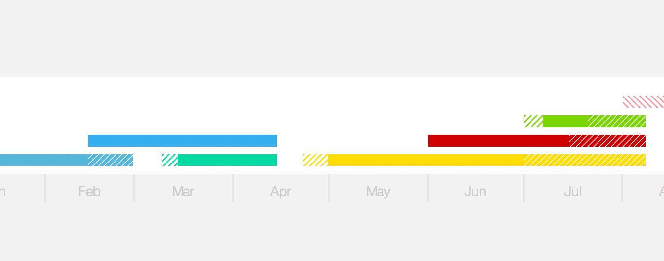
First off, this makes no sense. With a bar, you do have a start and an end, but they tell you nothing besides the start and end. What if I want to know if the project is ongoing? On top of that, there’s next to no information in between. Down the line, I’m certain we’ll need room for milestones and, potentially, other symbols.
All of a sudden, these bars started feeling like they represented a value other than time, especially when it came to invoices. An invoice that dragged on for months felt like a big-paying invoice. A project that spanned half the year but only required one day a week looked just like a full-time project. This lack of clarity became a real problem, to the point where I didn’t trust the visual. I had to spend a minute translating it before I could react and notice any valuable information.
Right when I was ready to leave for the day, I decided to quickly try out an idea. I scrapped the bars and started fresh. I tried to imagine a scheduling timeline without any history of what I have designed so far. Since it pertains dates and timespans, it should use dots and lines.

The dots will represent the dates. For projects, this currently includes the estimated start/finish dates and actual start/finish dates. For invoices, the issue date, due date, and paid date. Estimated dates shouldn’t carry the same weight as the actual dates because they’re not confirmed, so any estimated dates will have a different style—an outlined circle. Then, any actual date will be a solid fill.
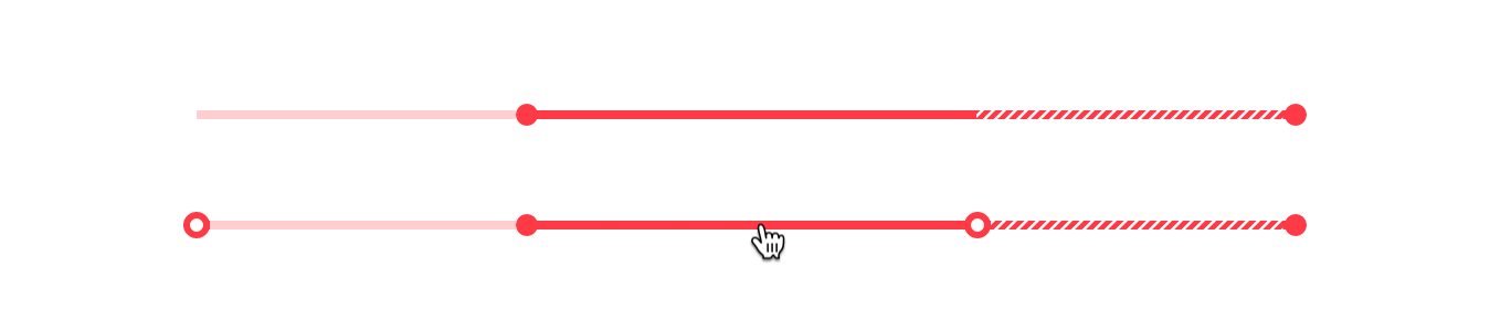
This felt like a lot of dots. Then I realized we could imply the existence of the estimated dates through the style of the line. If a project starts late, the line from the estimated start date to the actual start date should be a lighter version of the working line. That alone tells what we want to know, but then we can show the specific dates upon hovering the project. This way, we can establish an overall timeline UX of “hover to show more information”.
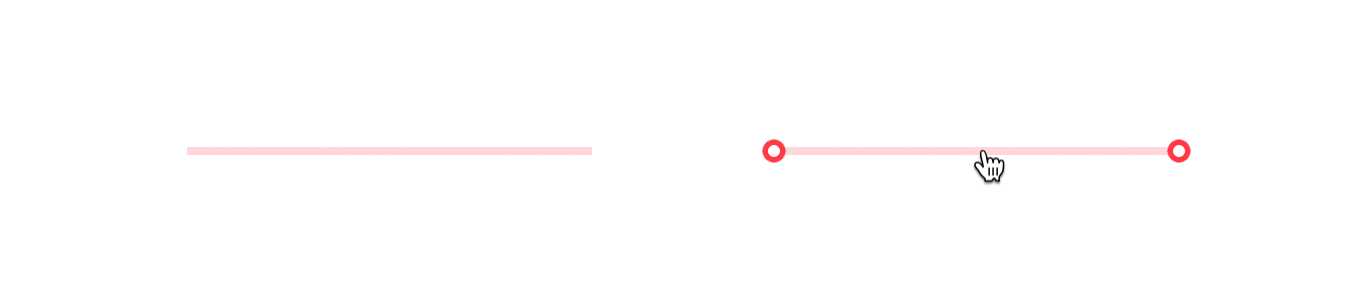
Hiding the estimated dates outside of hover also helps us when it comes to future projects. With no actual dates, these future projects are represented by only a light line—clearly showing that a project spans that timeframe, but it hasn’t been anchored with the weight of actual dates. Now there’s an obvious difference between a past project and a future project. But, what about current projects?
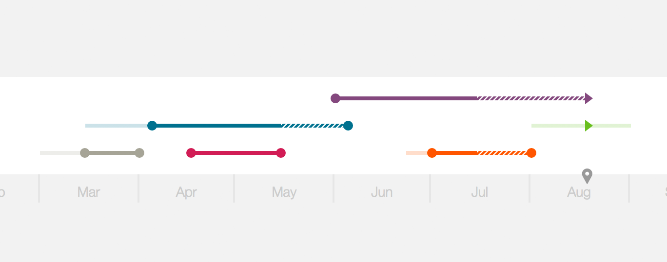
With the previous bar design, we had no clear way of knowing which projects you were actively working on or which invoices were in the pipeline. I wanted to be able to look at the timeline and immediately know how many projects were active and which ones. With this new design, I introduced a new element—an arrow.

For any project or invoice that spans the current date, an arrow will appear on that line. If a project has started, the line up until that arrow will be solid to show that you’ve actively worked on it up until now. The line after the arrow will remain lighter to indicate that you haven’t worked through that time yet, but it can potentially span that far.
An arrow was the first thing that came to mind as a way of showing activity and it worked right off the bat. I can clearly distinguish these projects from the others and I don’t need a label because it pointing in the direction of time is all we need to get the point across.

For projects that drag on, I reclaimed the hash pattern from the previous design. I still think it works with this new look as long as it’s the only place where we use a hash pattern. Also, like before, the pattern animates if an invoice is currently late. The movement is subtle enough to instill a sense of urgency, but won’t send you into panic mode.
In the previous post, I touched on a new tooltip design for the scheduling timeline, showing more useful information than just a client/project label. With this new design, I decided to take it a step further and show even more. Since we’re now working with several new elements—dots, lines, and arrows—we could utilize all three of these to tell us more about projects and invoices.

For dots, show the date that it represents and reiterate whether it’s estimated or not.

For lines, indicate the duration of the line and what it represents—early, late, drag, active, etc.

And for arrows, simply show that a project or invoice is active as of the current date. These new details help in revealing the additional information you would want to know, but it also keeps us from needing an additional key to reference.
After using the new scheduling timeline design for the past few days, I feel so much more confident and on top of things. I honestly can’t believe I even considered the previous design in the first place, but at least I know I’m making progress.