Cushion
Designing the subscription page
After months of thinking about “killer features” for Cushion, I arrived at the realization that there were still a few launch prerequisites I hadn’t finished, or even started. Here I was, thinking up feature after feature, expecting to launch soon, but I still didn’t have a subscription system in place, a way of downloading your data, or the ability to delete your account.
The paid beta runs on Stripe Checkout, using a one-time charge per user, which buys me exactly six months starting from the first user. Based on my past experience, I knew that time would dwindle and the expiration date would creep up faster than I would anticipate. I had to drop everything and focus on subscriptions.
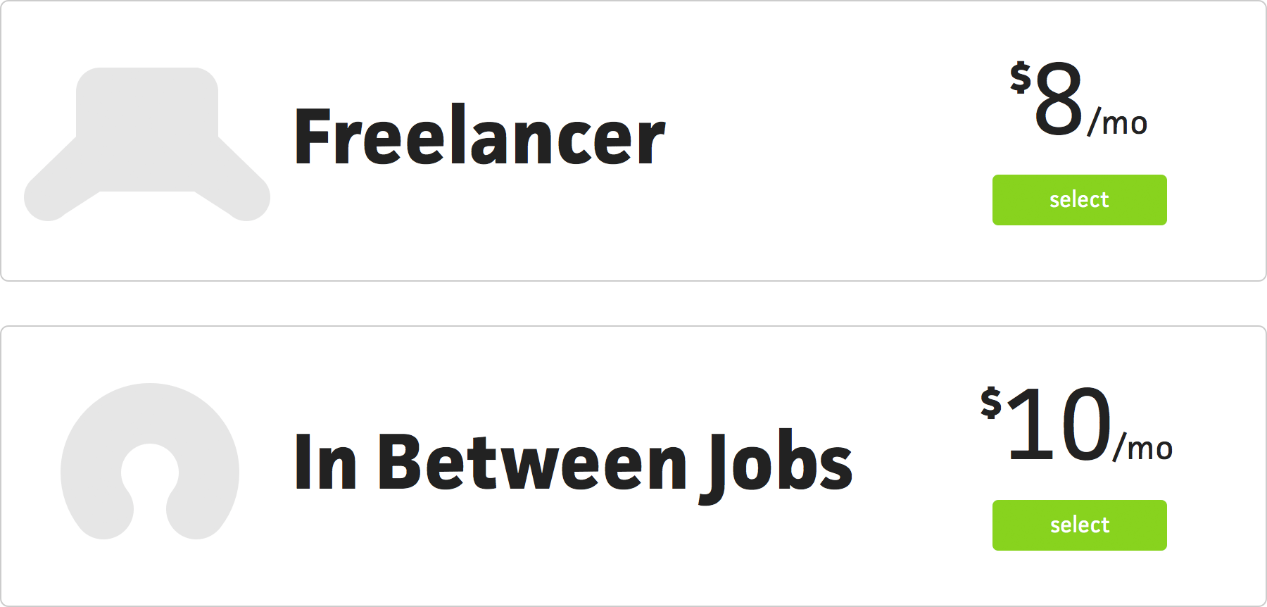
Since early on, I had a good idea of the direction I wanted to take with subscriptions. Instead of your typical 3-tier “solo, team, company”, I wanted to focus on the individual. I know I’m nowhere near even thinking about teams and beyond, so why even include them from the start? I do have a few small teams using the beta, and that works out really well with a single account holder, as long as they don’t need to do things like assign people to projects. For now, I’ll keep it simple.
By starting with a single plan, I can break that into two options by providing a monthly option and then a discounted yearly option. You’d be surprised by how often a user would rather pay a little extra for the month-to-month flexibility, but then again, maybe it’s not surprising—think gym memberships. I’ve had one for close to a year, still paying more month-to-month, but that’s only because I didn’t know if I would continue to go for an entire year. Now that I continue to go on a consistent basis, I still prefer the flexibility of having a monthly plan.
When it comes to web services or software, I always go for the yearly option because I know if I’ll use it or not from the trial and that 20% discount is tough to pass up on—especially when the cost isn’t that high. It’s usually only the services that range from $5-$50/month that offer the discounted annual plan, too. 10-20% off on a $100/year plan isn’t a big deal, but $100/month (or $1200/year) starts to add up. Or maybe they just know their audience—at a certain scale, the monthly flexibility provides more value.
In any case, it was time to stop only thinking about the subscription page and start designing it. Like most things I design from scratch, I start with the whacky ideas, just to get them out of the way. I know I probably won’t go with most of them, but I know not to discredit anything without going through the motions—I’ve had too many good ideas spawn from horrible ideas. All you need is something to take you in a certain direction and you can end up nowhere near the original idea, but better off because of it.
I tend to roll my eyes when companies get cutesy with their name, but I thought I’d at least try pursuing “Cushion” beyond the concept of a financial cushion and more towards a pile of comfortable pillows. It was bad.
The layout, the size of the type, and the icons—all bad. But that’s okay because this was my first shot with a blank canvas. It takes a bit to find a solid grounding. The goofiness of the icons made its way to the plan names, as well. Instead of saying “Monthly” and “Yearly”, I tried the playful angle, describing the user’s potential scenario.
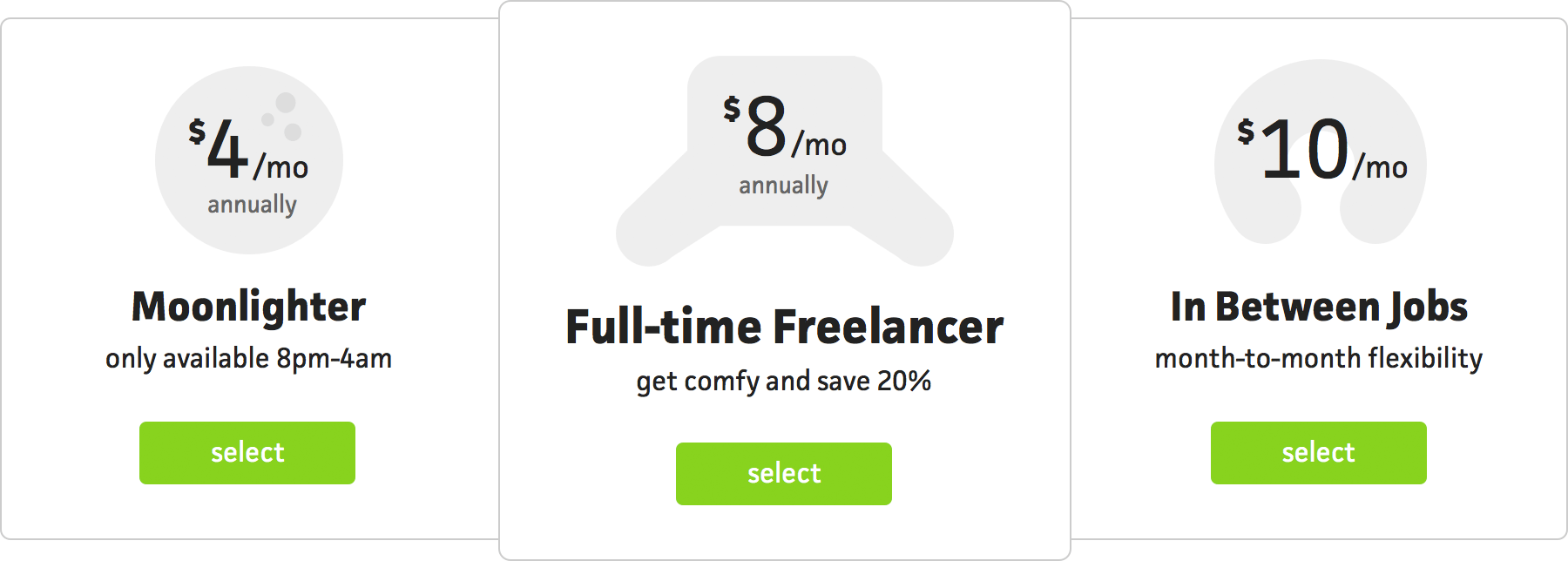
From there, I moved to the expected 3-column layout with the middle one being emphasized. I also introduced a third plan for an idea I’ve had for a few years now—a service only available within a specific timeframe. The service was originally going to be for people who work on personal projects at night, but this seemed like an interesting option for full-time people who freelance at night.
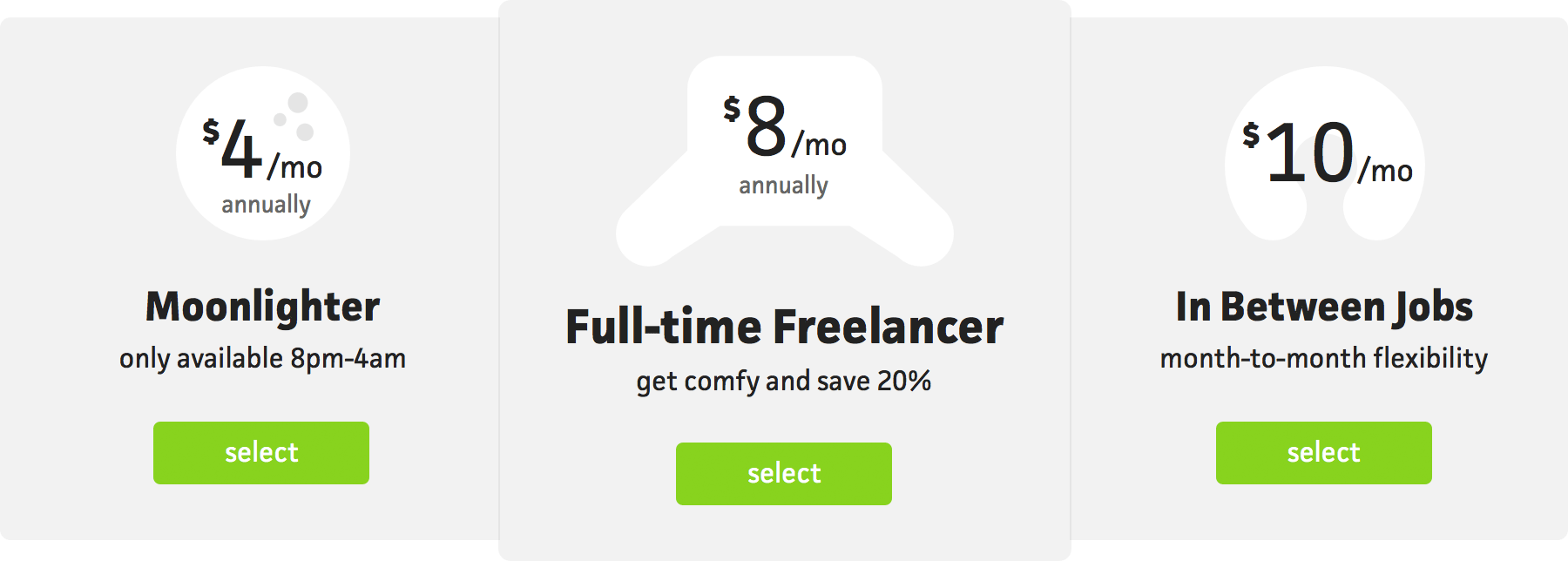
I tried a few other variations of this layout, like reversing the fills...
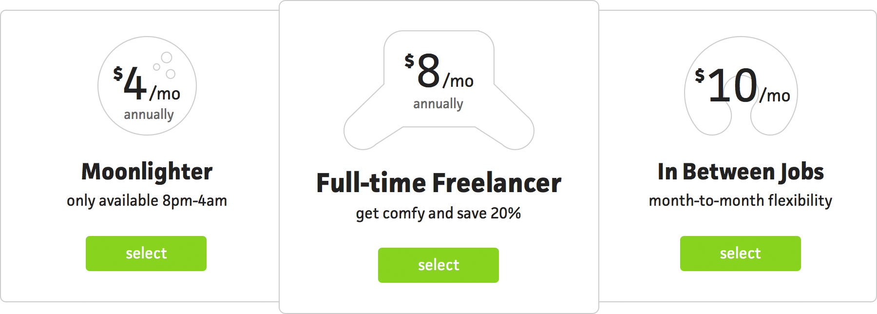
...using outlines instead of solid fills...
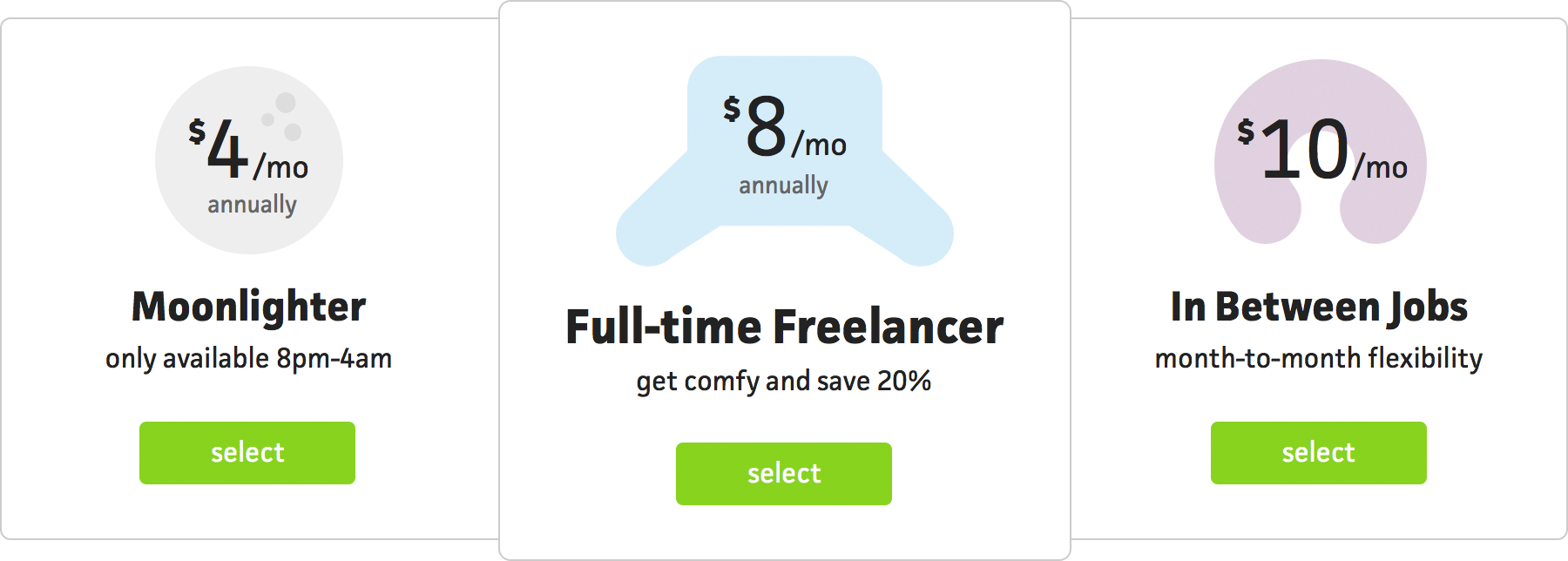
...and introducing color. None of these were right. For one, the plans were just confusing—you really needed to read into them to see that they were actually monthly versus yearly. The icons were also too playful for Cushion and just...bad. I was too hung up on having a moon icon that I forced the other two. Also, it wasn’t clear that the middle icon is a “husband” cushion and the one on the right is a neck pillow. It’s like I’m trying to tell an inside joke to a group of strangers.
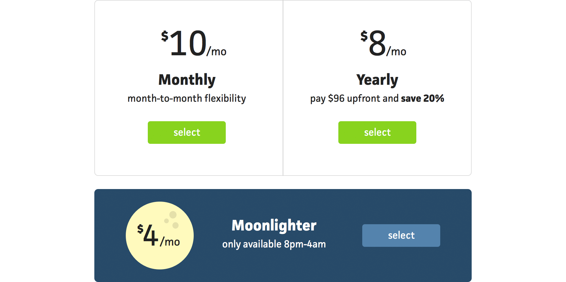
Next, I tried a two-column layout with the third “misfit” plan underneath. I also called the plans what they were, “Monthly” and “Yearly”, and removed the pillow icons. Immediately, it felt clearer, but still not right. The “Moonlighter” plan stood out too much for a plan that I didn’t want to emphasize. I was too hung up on how cool a “night” plan and that damn moon icon!

I also tried a variation of this design using yearly amounts for yearly plans. I thought this would be more upfront about the real cost of each plan, but it just made them more confusing. $10 vs $96 made it seem like the monthly plan was the discounted one.
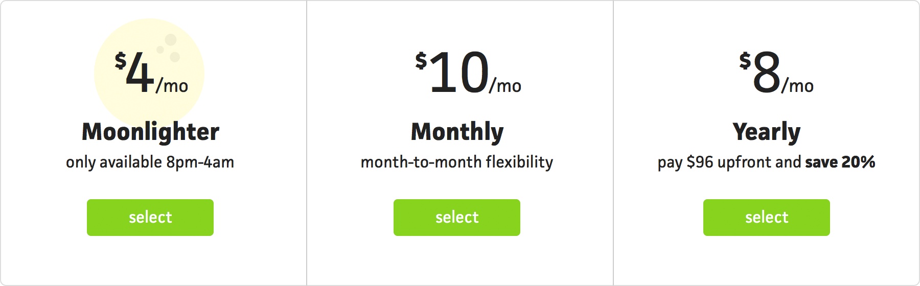
Because the two-column layout would be too narrow in the context of the app’s subscription page, I decided to move back to the 3-column design. I kept the moon icon to see if I could somehow make it work and added the yearly price to the one-liner of the yearly plan.
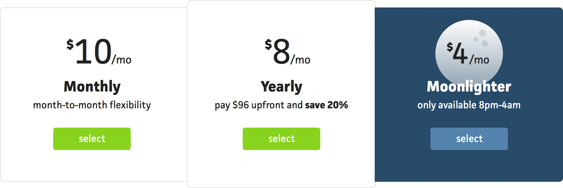
The yellow of the moon on white didn’t work, so I tried the dark background again—still too much emphasis. It looks so cool, though!
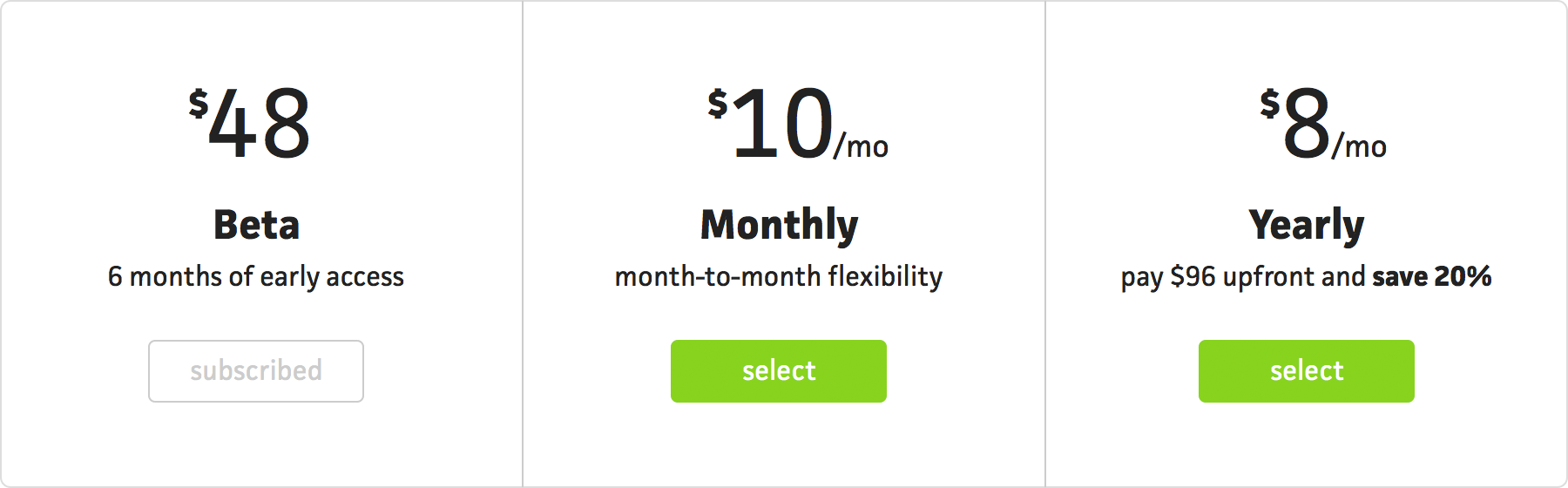
At this point, I took a step back and reminded myself that this first design is for within the app, under the subscription tab. I don’t need to be so heavy on the marketing side—it should just be an area to switch between subscriptions. Even though I think it’s a worthy concept, I decided to hold off on the “Moonlighter” plan for now. I need to work in increments rather than force all my ideas in at once. I swapped out the “Moonlighter” plan for the beta, since every user is a part of the beta. From there, they can upgrade or let the beta expire.
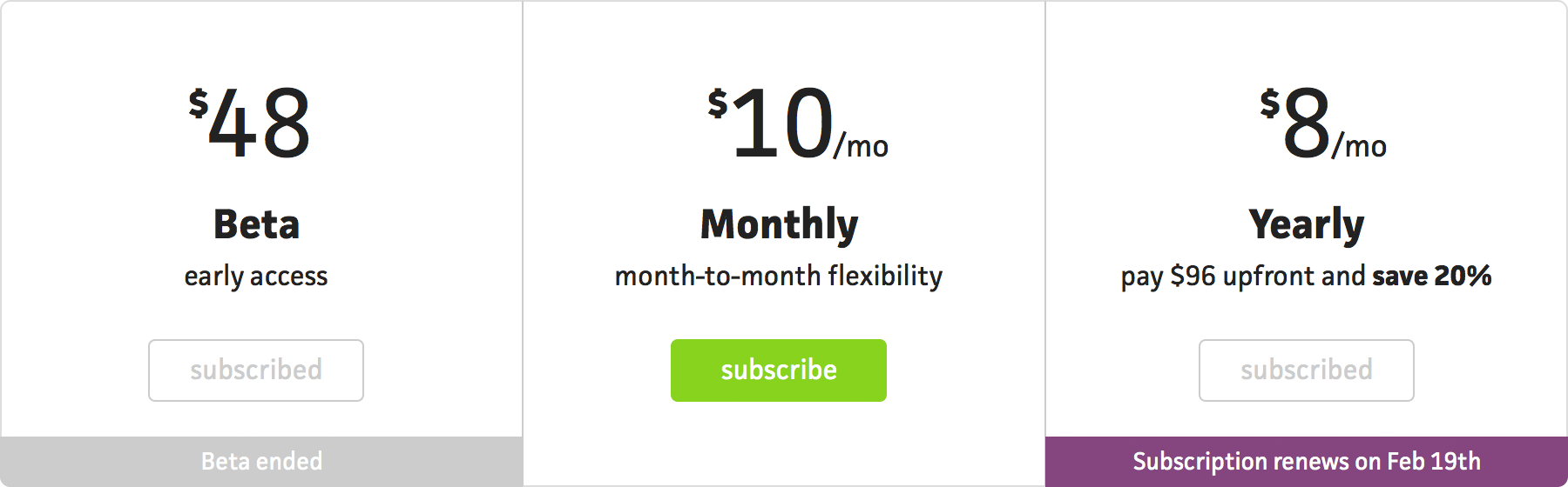
I also decided to add “ribbons” to selected plans, indicating when a plan’s subscription begins, renews, or ends. Whenever you’re dealing with payment-related parts of an app, it’s best to inform the user as much as possible about their current state. I want to do as much as I can to keep users from contacting support for questions that could easily be answered with a helpful UI, especially as a solo developer.
So, this is where I ended up. I’m really happy with the end result and glad I got the wackiness out of my head. The next step now, regarding subscriptions, is to design the public-facing plan page. This will need to be more than just a copy/paste job, as it has to include a list of features and FAQs, considering the potential user hasn’t used the app yet. That’s for another time, though.
On a side note, I still have a few more spots in the paid beta. If you’re interested in participating, request an invite and I’ll send one your way.