Cushion
Designing a new layout system
In August, I shared some very rough sketches of potential design ideas I’ve been considering for Cushion. Since then, I’ve honed in on a direction I’m increasingly happy with. The main issues I’m attempting to fix include:
the depth of the existing sections, which require several clicks to get anywhere while losing your original position in the app
views that try to do too much, like the schedule and budget views that have sub-tabs for clients and projects
the lack of clarity around where you are and where you want to go, like the list of clients being buried in a section’s sub-tab rather than living on the top-level
All of these issues are somewhat related, so fixing one makes progress towards another. At the same time, I’m trying to make the app more mobile-friendly, so another goal is designing the layout in a way that easily reflows down to mobile. Overall, I’m really excited about the direction I’m working on because I think it’ll be a huge step forward towards modernizing the app while also correcting years of buildup from designing-on-the-fly.
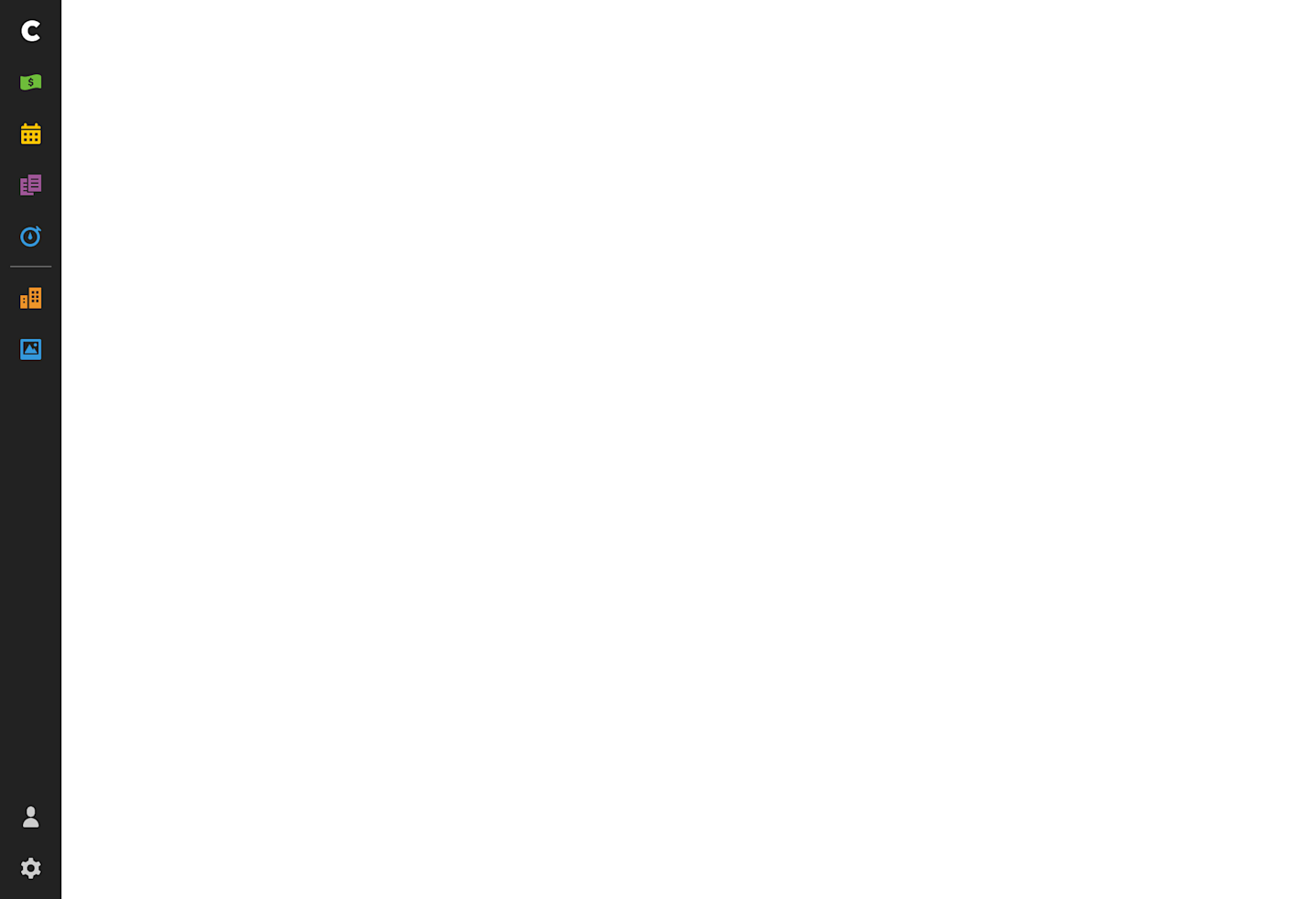
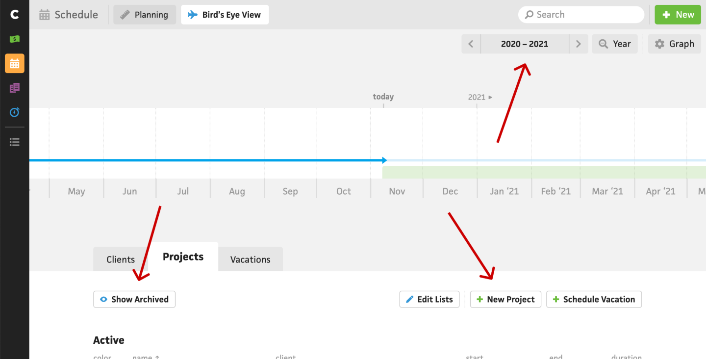
To anchor the layout, I’m retaining the sidebar nav from the existing app. It’s familiar to users and does its job, so no need to change the design there. I am planning to promote “Clients” and ”Projects” to the top-level nav, however. This will fix the issue of them feeling buried while also opening up the doors to relevant subsections, like “Insights” or ”Reports”. I’m not 100% set on colors, icons, or anything, so don’t judge yet.
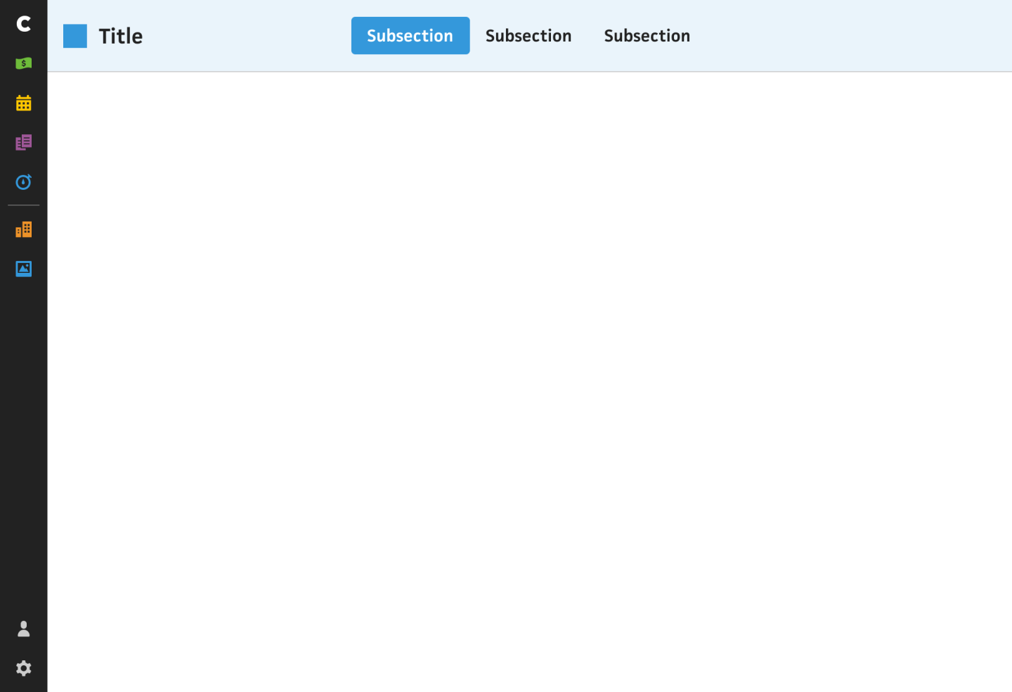
On the top nav, I’m introducing color as a way to distinguish each section—this will also give some more life to the app rather than feeling too grey throughout. I haven’t decided on the top right, yet, so I left that empty for now. While there are still nav items in this top nav, they’re more related to the section you’re in. I’ll explain.
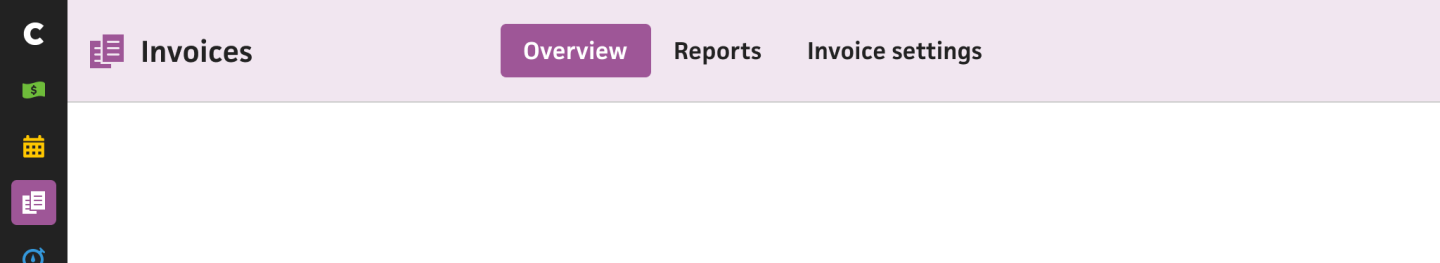
Recently, I promoted the “Invoice” section to the top-level nav because it was previously buried in the “Budget” section’s subnav. With the way I’m planning to approach the top nav, I can easily avoid issues like this. Instead of these subsections being entirely different views, they’re more like variations of the section you’re in. In most cases, there will be:
an “Overview” subsection for a high-level summary and quick admin work, like a clear list of outstanding invoices and the ability to easily mark them as paid
an “Insights” or “Reports” subsection for a more detailed look at your data with proper filtering and exporting
a “Settings” subsection for settings that are specific to that section, instead of throwing all your settings into one bucket and hoping you know what they relate to. For example, the invoice email settings are currently buried in an ambiguous top-level “Manage” section that’s essentially a junk drawer. Now, these invoice email settings could live under the invoice section’s settings, where it makes more sense.
This will bring so much more clarity to the navigation, so you can settle into one section at a time without needing to jump all over the place.
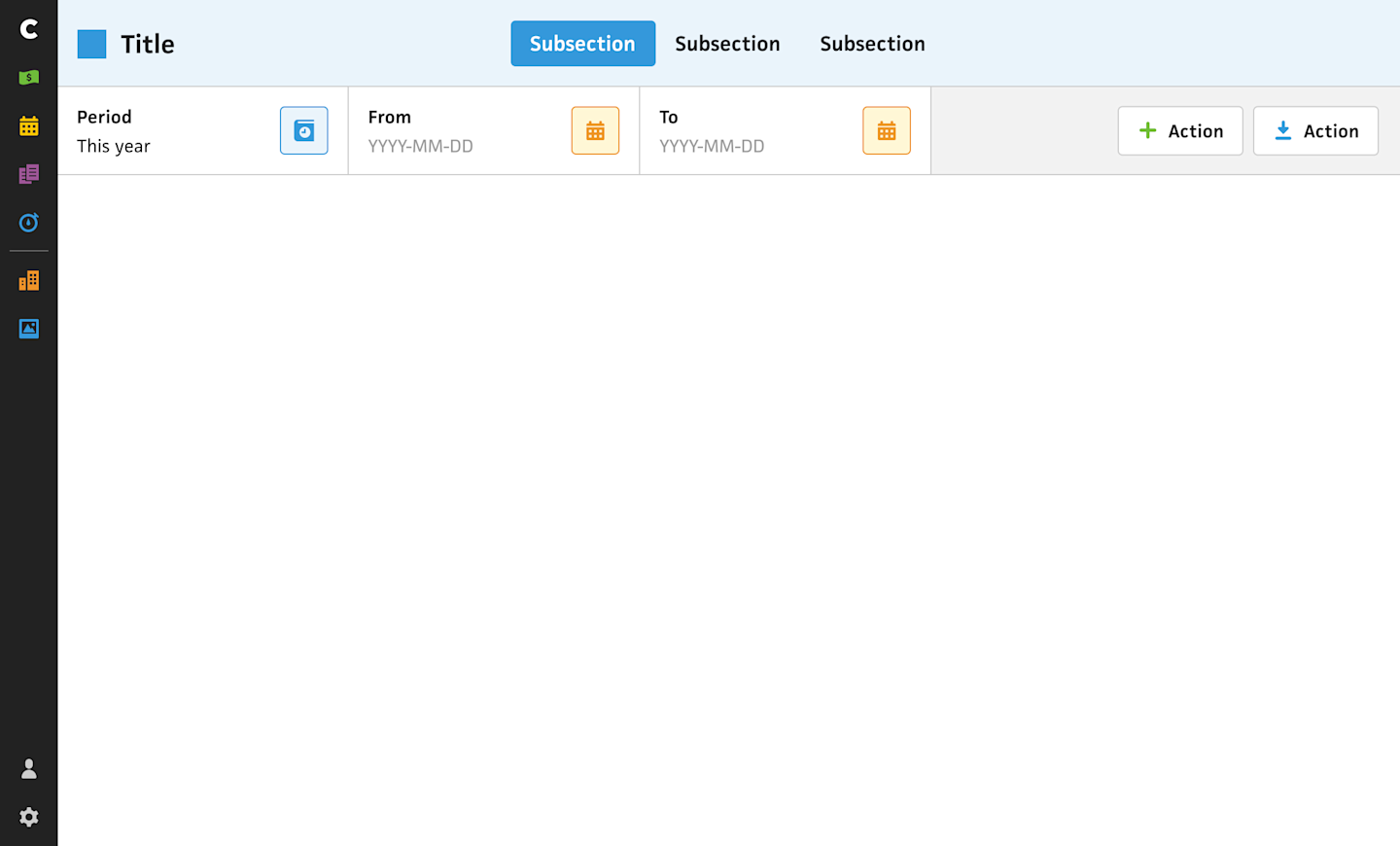
Next, we have a “secondary” bar below the top nav that’s split between filters and actions. “Filters” are input and dropdown fields that let you narrow the content of the section, so if you’re looking at your invoices and only want to see invoices paid in 2019, you’d use the filters to easily see that. “Actions” are buttons that do something, like create a new project or export the current view as a CSV.
The existing Cushion actually has filters and actions already, but they’re spread throughout the view and don’t feel as solid as they “float” within the UI. I’m hoping the new layout makes them feel more consistent, expected, and useful.
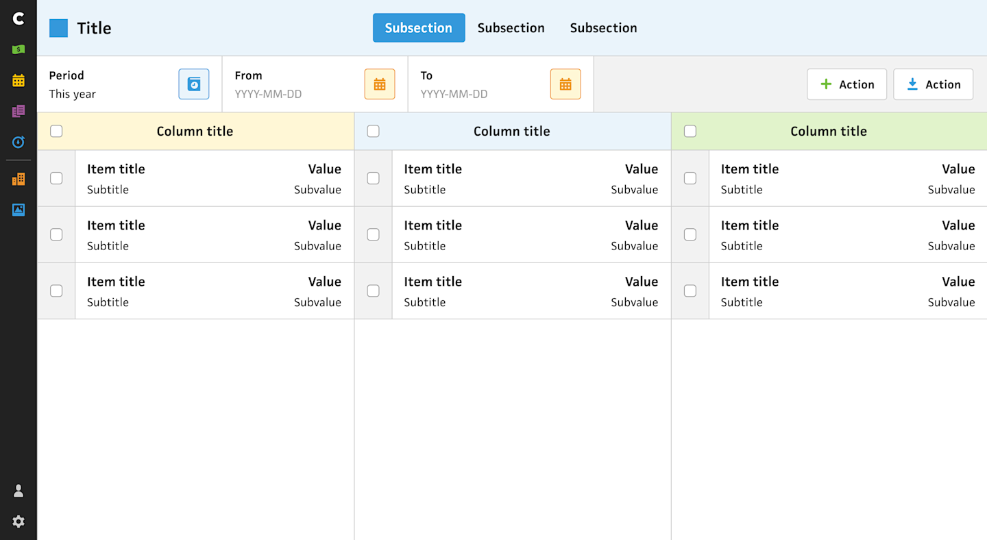
The area below the secondary bar is open for however the section needs to use it. For admin-style sections where folks will be able to quickly get their account up-to-update, I plan to use a kanban-style UI for drag-and-dropping between columns. I imagine this layout will be especially useful for project stages and invoice statuses.
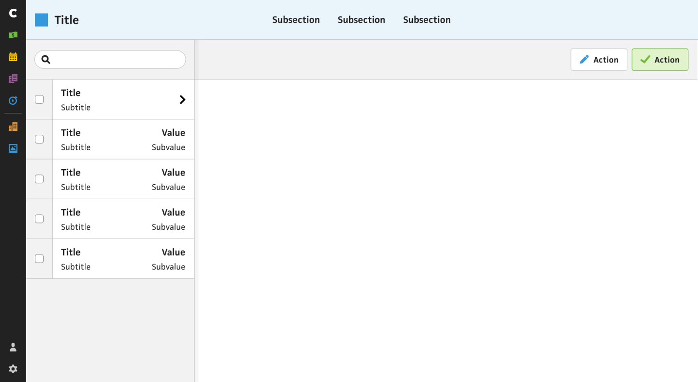
Another available layout for this area is for clicking into an item, like a client or project. Right now, if you clicked into a client, Cushion would take you to a client page where you’re pretty much stuck. If you wanted to view a different client, you’d have to go back to whichever section you were in, find where it was listed, then click into it. I definitely wanted to fix that poor experience, so this layout includes a sidebar that lists the rest of your clients. Switching to another client only requires a single click, and you can easily search the list using an input filter.
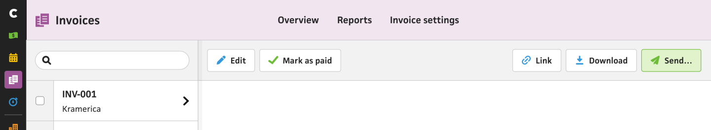
On the right side of the layout, there’s a secondary bar for actions. For an invoice, this would include the “Link”, “Download”, and “Send” buttons from the existing invoice preview. The bar will also be sticky, so you can scroll the content without losing the ability to press a button. I’m especially excited about this layout for invoices because it’ll be so much quicker to go down the list without clicking back and forth.
I’m still working through a ton of the details, but this should give a good sense of where I’m hoping to take Cushion. Now that I’ve lived with the app for nearly seven (!!) years, I have a much better idea of what to expect and what I need to make room for. I know the implementation won’t happen overnight, but I feel good about the incremental migration plan, which will let folks try it out as I’m working on it versus flipping a switch and hoping they like it.