Cushion
Designing a breadcrumbs component
In the first month of building Cushion’s new invoice form, I made giant strides of progress—the form itself, the complexity of the line items, wiring the API requests, etc. Lately, however, I’ve been focusing on the tiny parts that may seem insignificant at first, but are actually crucial to an intuitive UX. The most recent of these little details is breadcrumbs—the clickable path to the current view. For the invoice form, this path is more about the path from the client to the invoice rather than being 1:1 with the route path, but it’s valuable nonetheless.
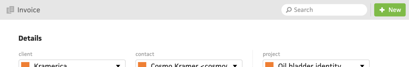
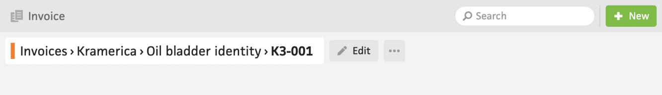
Believe or not, the current invoice form actually doesn’t have breadcrumbs, so if you need to navigate to the invoice’s client or project from the invoice form, you’re out of luck. I did add breadcrumbs to the actual invoice page several years ago, but didn’t manage to bring them over to the form as well.
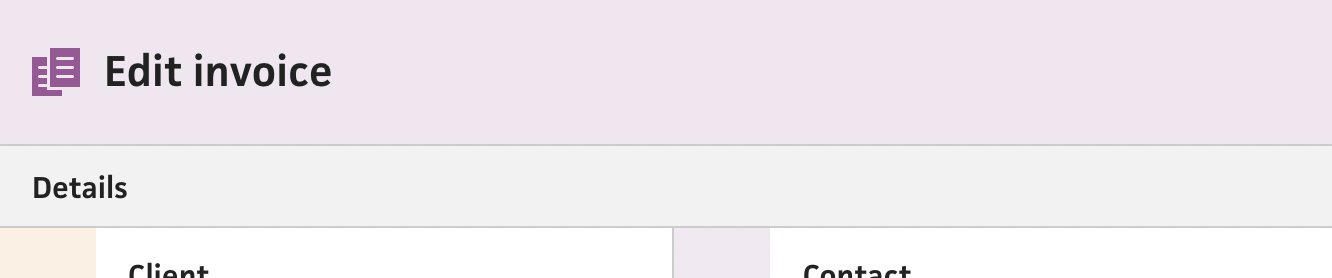
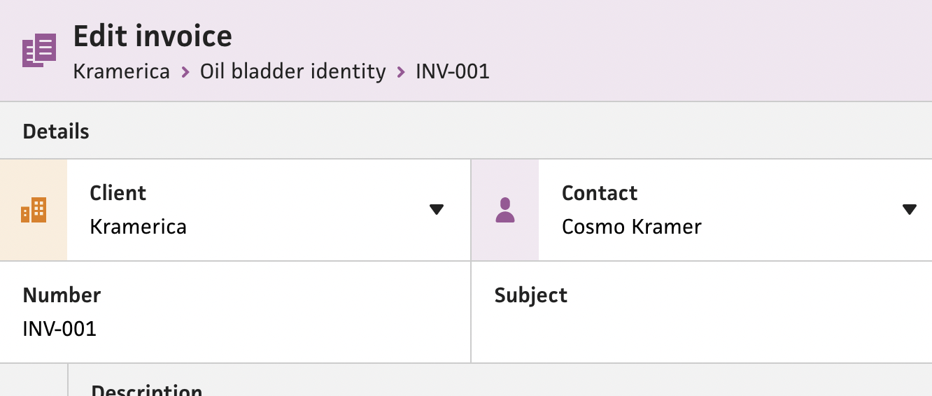
In the new system, the top nav bar actually provides the perfect height to sneak the breadcrumbs under the title, which makes perfect sense for the overall grouping and hierarchy. Compare this to the existing invoice page, where the breadcrumbs are actually in a subview of the top nav bar, which creates a bit of separation along with a cluttered feel from the “edit” button and dropdown.

Also in the existing system, I tend to use the special character, “single right-pointing angle quotation mark” (›), for breadcrumbs, which is much nicer than the typical “greater-than sign” (>). However, I realized from the name that this probably isn’t the best character to use. Instead, with the new system, I wanted to use a proper icon that could visually separate itself from the text and blend more with the background, so I used a right caret icon. This differentiates itself enough from the text with an accent color and slightly thicker stroke.
For the implementation, I foraged the internet for the most semantically correct approach for breadcrumbs, and narrowed in on the WAI-ARIA Authoring Practices, using an ordered list of anchor links, wrapped in a nav element. The nav should have an aria-label attribute with a “Breadcrumb” value, and the last link in the list should have an aria-current attribute a “page” value.
<nav aria-label="Breadcrumb" class="breadcrumb">
  <ol>
    <li>
      <a href="../../">
        WAI-ARIA Authoring Practices 1.1
      </a>
    </li>
    <li>
      <a href="../../#aria_ex">
        Design Patterns
      </a>
    </li>
    <li>
      <a href="../../#breadcrumb">
        Breadcrumb Pattern
      </a>
    </li>
    <li>
      <a href="./index.html" aria-current="page">
        Breadcrumb Example
      </a>
    </li>
  </ol>
</nav>
With the invoice form, however, using aria-current might not make sense because the invoice breadcrumb will actually go to the invoice itself—not the form. Also, a new invoice won’t have an invoice breadcrumb, so I’ll need to leave it out completely instead of assuming that the last link in the list is always the current page.
Once I had a plan, I built a new “BreadcrumbNav” component that takes an array of items with labels and routes. I also added a slot to the top nav bar, so I can compose the breadcrumbs within it and let the bar’s layout adjust to accommodate them. I was actually able to automate the aria-current attribute by checking if the current route matches the breadcrumb’s route, which is obvious after-the-fact, but didn’t cross my mind earlier. Lastly, I inserted the chevron icons, but used a role attribute with the value “separator” to indicate that they’re not actual breadcrumbs.
This marks another item done on my to-do list. I still have a ways to go, but incremental progress like this feels so good compared to a long-standing PR that just grows and grows.