Work
Building the Casper homepage
In September, I decided that it was time to take a break from client work. I would focus 100% of my time on my freelancing app, Cushion, and hopefully reach a point where I could live off its income.
One week later, however, I received an email from Gabe Flateman, CTO and co-founder of Casper. If you live in New York, you’re probably well aware of Casper because their subway ads are everywhere. In short, Casper is a mattress startup with emphasis on quality, affordability, and customer support.

Casper subway ads by Red Antler & Tomi Um
Typically, I would’ve stuck to the plan of going clientless, but Casper is an enticing client—I simply couldn’t pass up the opportunity to at least chat. If anything, this would allow me to work full-time on Cushion for even longer.
I met with Gabe and he filled me in on their plan to start offering pillows and sheets along with their signature mattress (not my typical client). To announce their new products, they needed a fancy new homepage.
I’ve worked on a few animated websites in the past, and that’s exactly how Gabe found me. These websites are fun because they give me the chance to experiment. I also do my best work under the pressure of their challenges and countless unknowns, like whether the website is even possible.

“Dream Sandwich” sketch from Alex Malkin, Digital Experience Director at Red Antler
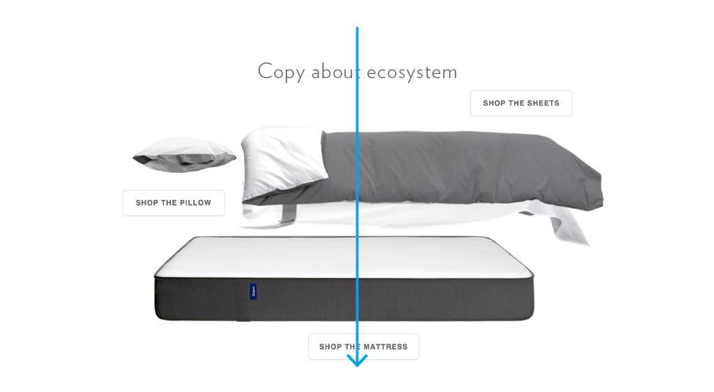
Gabe told me about their “Dream Sandwich” concept, designed by the creative studio, JaegerSloan. The bed would separate in mid-air and each product would float up the page as the user scrolls. Then, the products would float back down and land as a complete bed.
We discussed possible approaches, like scrubbing through a video or swapping out still images. Video is easy, but sacrifices quality and control. Stills are more flexible and higher quality, but at the cost of file size. Regardless of the direction we took, it was clear that this would be a real challenge.
I had experience animating with still images from my work on the FiftyThree Pencil page, where a hand holding a Pencil rotates as the user scrolls. That, however, was only a small section of the page using only a dozen images. The Casper website, on the other hand, would potentially be hundreds of hi-res images spanning the entire window.
The countless challenges raced through my mind as Gabe and I chatted—file size, performance, file size, image quality, file size, deadline. I could’ve walked away, but after brainstorming and talking through all the obstacles, I felt invested in the website—I wanted to be the one to make this special.
I accepted the gig.
I need to constantly remind myself of how fortunate I am to attract this caliber of client, and more importantly, that building websites even counts as a profession—let alone a valuable one. At any time, tides could shift and the industry could take a nosedive. It sounds far-fetched, but I was once a skilled Flash developer.
Gabe sent me a CodePen prototype they made for scrubbing a video with the scrollbar. CodePen and other web-based IDEs were completely foreign to me, so this was a first. I forked Casper’s prototype and added friction to make the scrubbing smoother. I was blown away by how easy it was to set up and share iterations. So much, in fact, that I decided to use it for the rest of the project.

Iterations in CodePen
These websites tend to go through dozens of iterations, so CodePen was the perfect tool for me to quickly make changes and get instant feedback from Casper. Whenever we decided to go in a different direction, I would simply fork the latest prototype and move on. This left me with shareable save points that I could easily link to.
After considering all of the potential issues with video, like aspect ratio and browser compatibility, we decided to ditch that approach. This was definitely for the best because if we were to discover a deal-breaker after shooting the video, we would be in a really sticky situation. By using still images, we would at least have some outs if anything went south.
The Gazelle camera crane photographing the Casper mattress
JaegerSloan was smart and shot each product individually—this gave us more control over scaling and positioning. They used a Gazelle camera crane on a green screen, which provided us with a smooth series of angles that we could select from. If I learned anything throughout this project, it’s that Casper does not mess around when it comes to big ideas.
With a tight deadline and no readily available assets, I had to make the most of my time. While JaegerSloan worked on touching up the images, I started coding a prototype using colored blocks as placeholders. This allowed me to focus on the timing, positioning, and feel of the animation before even thinking about actual images.
A prototype using colored blocks as placeholders
A few days later, JaegerSloan provided us with draft images for picking which frames we would need for the final animation. Because of the tight deadline, we didn’t have the luxury of touching up every single image from the photoshoot. And because of the concern with file size, we needed to know the frame rate that would require the fewest number of images while still feeling smooth.
With the FiftyThree page, I was able to keep it simple by loading a dozen images individually. With Casper, however, I’m dealing with hundreds of images, so the number of requests became a big concern as well.
Instead of loading images one-by-one, we needed to use sprite sheets—combining every frame of a product as one image. If we have 5 products on the page, the browser would only need to load 5 images with 100 frames versus 500 single-frame images. The file size would also be much lower because the images within the sprite sheet could share colors.
A sprite sheet of Casper sheets
I wrote a script that takes a folder of images, compiles them into a sprite sheet, and optimizes the sheet to save even more on file size. The result is a single image and a CSS file of the background positions of the frames within the sprite sheet. In the Javscript, I simply change the class name of an element to display the correct frame.
The code I used to control the positioning and timing of the animation is step-based, similar to the system I wrote for Dropbox’s Carousel website. Each step has a duration and an array of items to animate. And each item has start/end values for each property (x, y, etc). The current step is detected based on the scroll position. The items then animate based on the scroll position within the current step. Everything is based on relative percentages, so if a specific step needs to be shortened or lengthened, I can increase the duration of that step and the animation will adjust itself.
A prototype using draft images
Now that we were using draft images instead of colored blocks, I was able to get a much better sense of the animation’s feel. It was exciting to see everything coming together—even as a draft. I tweaked the timing and positioning to smooth out the rough spots and shared the new prototype with Casper.
When we received the final images from JaegerSloan, it felt like Christmas. I had been working with the draft images for so long that I forgot that they were drafts—my brain learned to ignore their rough edges and color. Once I swapped out the drafts for the retouched images, everything instantly felt like a real webpage—no longer a prototype.
A prototype using final images
While I worked on the website, the Casper QA team performed user tests with each major iteration I sent them, rather than launching and hoping for the best. With the final images in place, they were able to discover a few difficult truths.
Users weren’t connecting with the room
Users didn’t realize that Casper was announcing pillows and sheets
Users thought Casper was introducing pajamas
With two weeks remaining before launch, these results were hard to swallow. We had to make some big changes, but fortunately, not all was lost. To make the room feel more relatable, Casper brought back the hero image with one of their lifestyle photos. This provided a more realistic image of a bedroom with more emphasis on the announcement copy. Instead of distracting the user with an animation right off-the-bat, the still image would give them time to digest the copy and realize that Casper now has sheets and pillows.
The rest of the page, including the animation, was more up-in-the-air at this point. Casper’s Director of Design, Huy Vu, and Senior Designer, Jarrod Barretto, focused on a new design. It would reuse the elements of the animation, but ditch the idea of the step-based animation.
A sketch of the new direction
After the hero, the user would see the separated “Dream Sandwich” with buttons linking to each product. They would then scroll through the individual products before hitting the rest of the page. As the products move up the page, they would “rotate” with the scroll to create the illusion of 3D perspective.
I started on the new prototype and was blown away by how much code I was able to remove. I treated each section of the page as a self-contained block with its own scroll percentage. The items would move up the page like normal HTML elements, but the “rotation” would be determined by their independent position on the page. This approach cut the code to roughly 30 lines, down from over 600.
The final iteration
The final design immediately felt more like a webpage than any of the previous iterations, and I find the design much more effective than a complex animation—it doesn’t hijack the scroll or move elements against the grain of the page. If the user scrolls quickly from top to bottom, they might not even notice the rotating products, but once they do, it will wow them even more.
I spent the last week before launch moving the code from Codepen into Casper’s repo. Joseph Cortbawi, one of Casper’s front-end engineers, worked closely with Jarrod to fine-tune the hero across screen resolutions and orientations while Kei Sato, another front-end engineer, helped with the shop modules at the bottom of the page.
In the final hours, Betty Liao, Casper’s Digital Project Manager, tested a gnarly iOS7 bug for me while I attempted to blindly fix it (without the device). A few stressful minutes later, I merged my final pull request and called it a night. Casper launched the next day.
In the end, I’m thrilled with how everything turned out. The homepage fits that perfect balance between subtle and special without going overboard with animations. I had a blast working with the team and witnessing them build the rest of the website around my small contribution. I look forward to watching Casper grow, and I hope to hear from them again when they inevitably launch pajamas.
You can view the archived Casper homepage here.