Redesign
Homepage concept
The concept of building a mashup of my portfolio for the homepage first came to mind when I originally thought of redesigning the previous version from 2016. I found myself with several scroll-based portfolio pieces, which combined to describe my style of work really well—smooth, subtle, and delightful. Initially, I pictured the implementation on a much smaller scale. Each portfolio piece would live either as a decoration off to the side or all in a row. Before too long, real work took over, and I didn’t revisit the idea until years later, but the urge to follow through with it grew stronger as it continued to live in the back of my mind.
In September, I launched my first page at Stripe where I was the Site DRI, or directly responsible individual. Prior to building this page, the homepage concept would’ve fallen flat because I didn’t have much to show for my work at Stripe. I certainly contributed to several pages, like the responsive carousel on Marketplaces or the donut chart on Corporate Card, but I wanted to wait until I had a hero animation under my belt. I wanted the opportunity to instill those previously mentioned qualities into my work at Stripe. Once the Capital page launched, I knew I had what I needed to pursue the portfolio mashup concept.
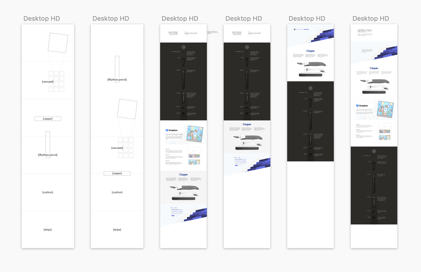
Layout sketch for the homepage
I had a general layout in mind, with a brief intro before diving into the animations, but I didn’t have a strong grasp on the right order or amount of content. In my first sketches for the page, I had three-to-four times more copy than I ended up with. Once I found myself spending the majority of my time reworking the copy, I knew it would be better to simply cut it down to a sentence or two per portfolio piece—especially since I had already written entire articles about them.
For the order, I initially thought of starting with my oldest piece, then going chronologically until I reached Stripe. It felt okay, but more random than considered. Then, someone at my studio suggested reversing the order. Since I start by saying I work at Stripe, why not show the work I’ve done at Stripe first? This is yet another instance where I’m in my own head too long before a simple observation makes everything crystal clear.
From there, the layout was smooth sailing—each piece seamlessly fit into place—but I didn’t know how to end the page. Instead of only showing my “portfolio” in the sense of websites I’ve built, I also wanted to include my other work, like my writing and Design Town, the studio space my wife and I started. Still, this didn’t answer the question of how to end the page. I needed some sort of CTA, or call-to-action. I’m accustomed to building CTAs into product pages, but what’s the CTA for an individual who isn’t looking for work?
I decided that my CTAs should lead people to read the rest of the blog, let them follow along on Twitter, and contact me if they need to get in touch. While these were clear cut, I also wanted to embrace the awkwardness of ending the page abruptly. At first, I jokingly wrote “That’s it. That’s the end of the page.” similar to the end credits to the classic film, Ferris Bueller’s Day Off, but then I decided to pull it back a bit. By writing “That’s it for now”, I open up the page to being a continuous, ever growing work-in-progress. As I build more pages, or work on more side projects, I can simply slide them into the page, and it’ll work.